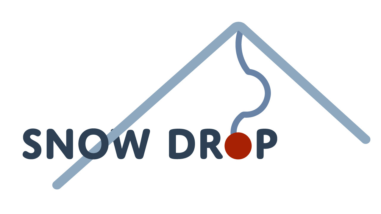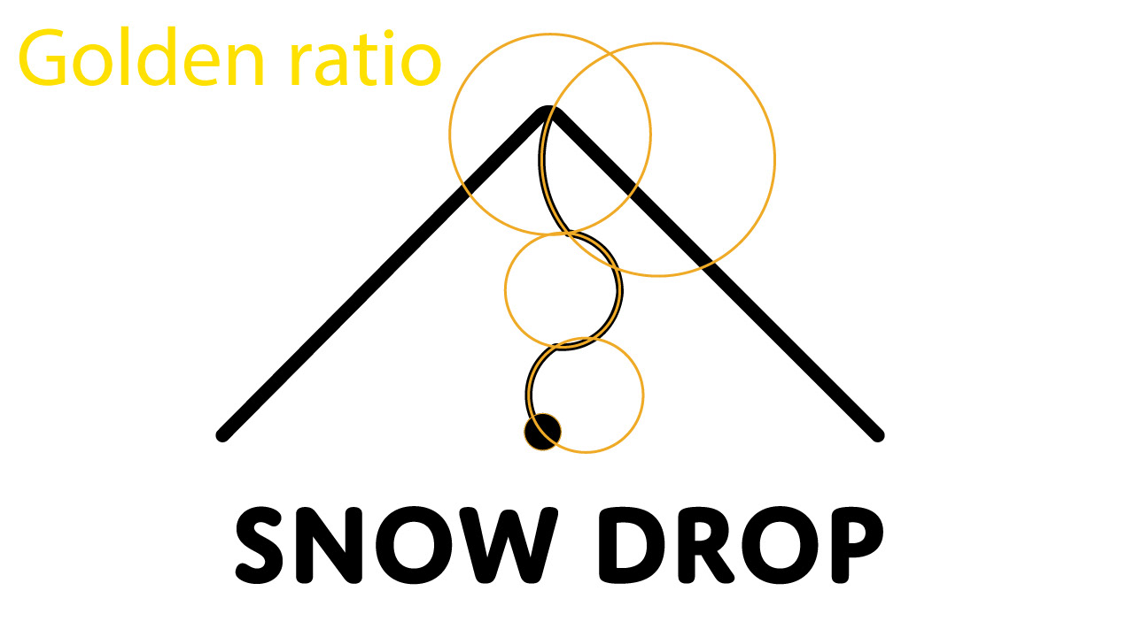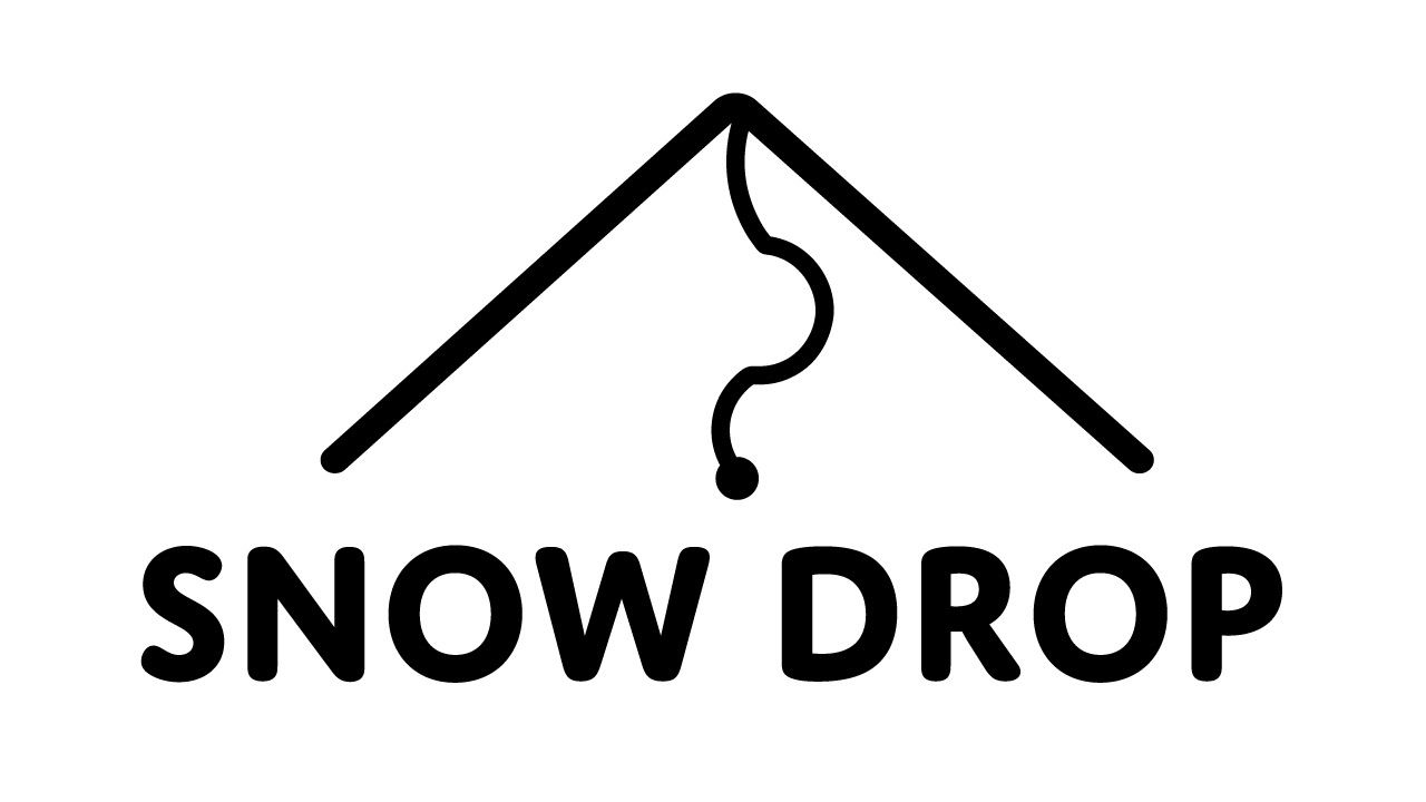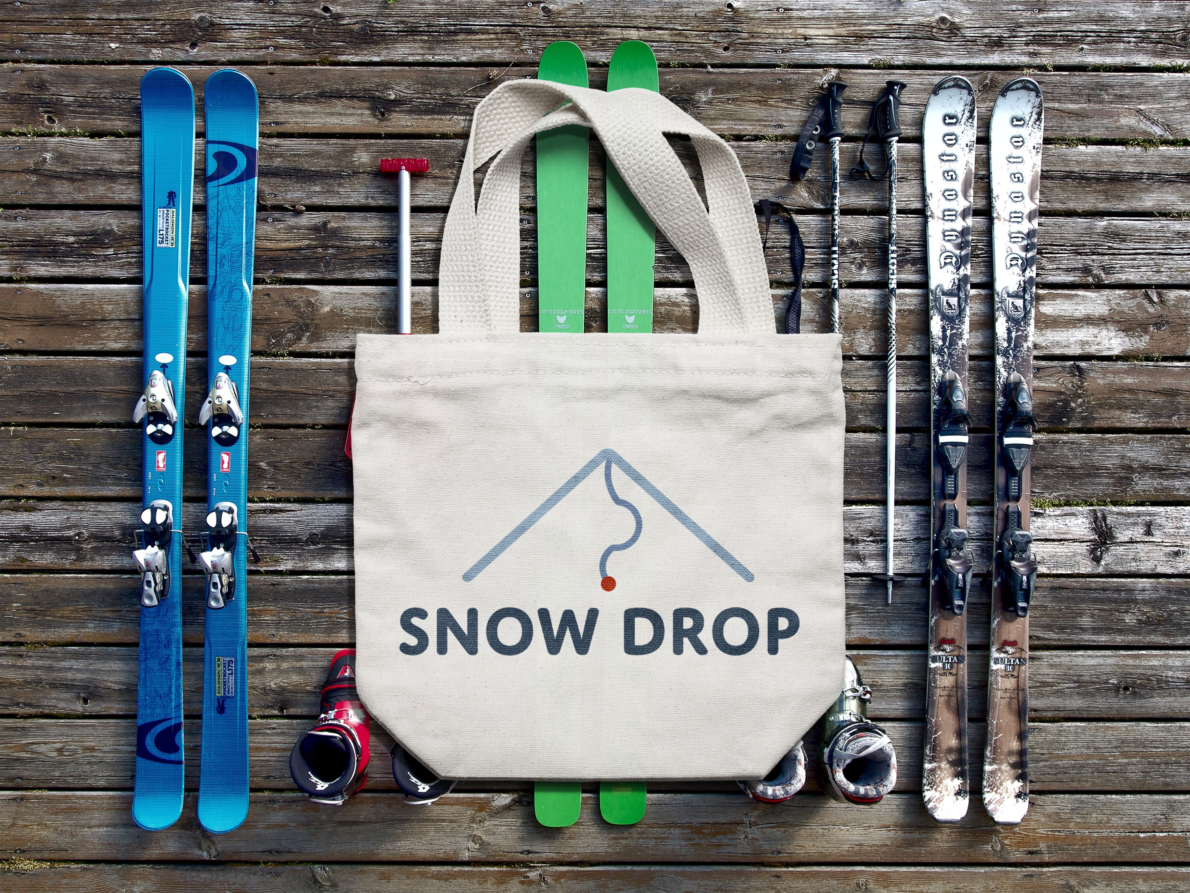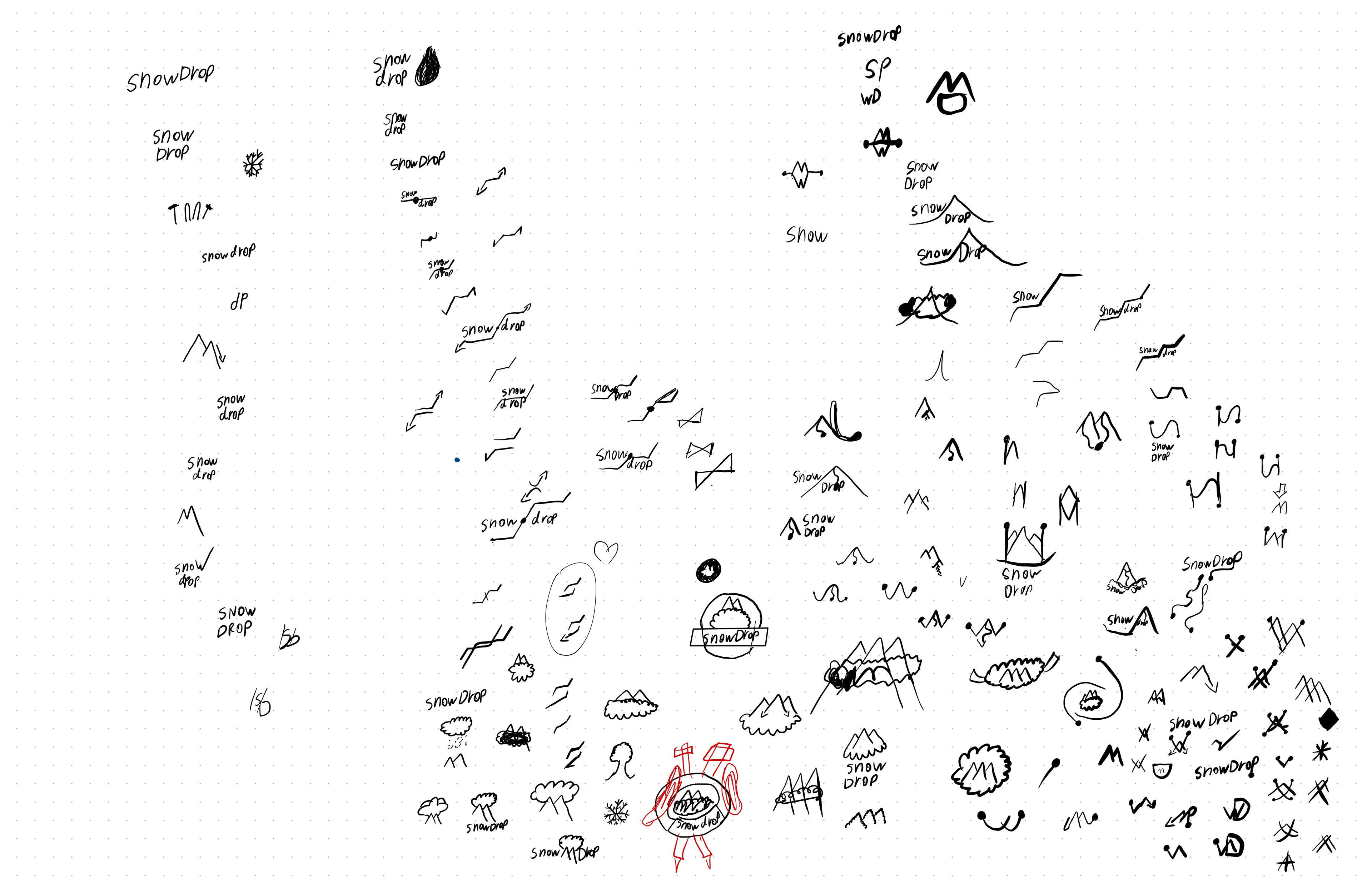
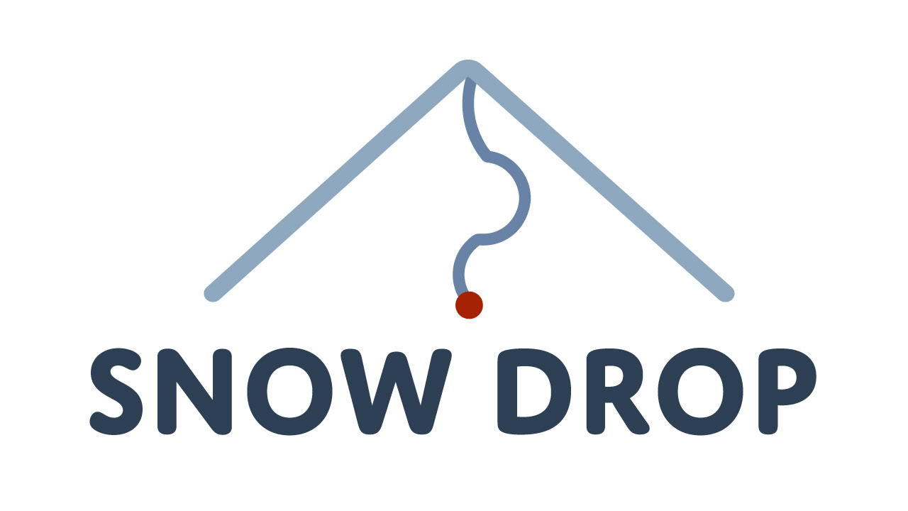
The logo SnowDrop is made for a ski company. it has to include elements of snow, ski and 'dropping'. This logo represents a mountain, where a path is carved to a red dot which is perceived as the destination. The color pallet here is blue/red. Blue represents the winter, mountains, height and snow. Whereas red is a contrast towards this blueness, and the mark of the destination whereas one skies. The color blue becomes darker the more downwards the logo goes. The golden ratio is used in order to make the curves on the path.