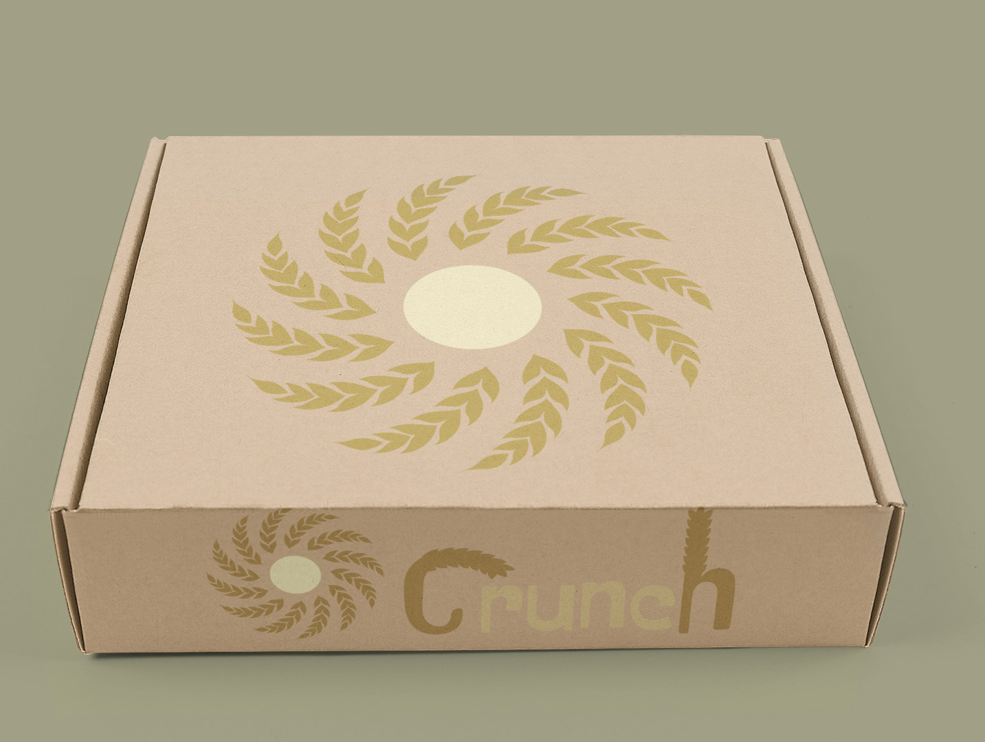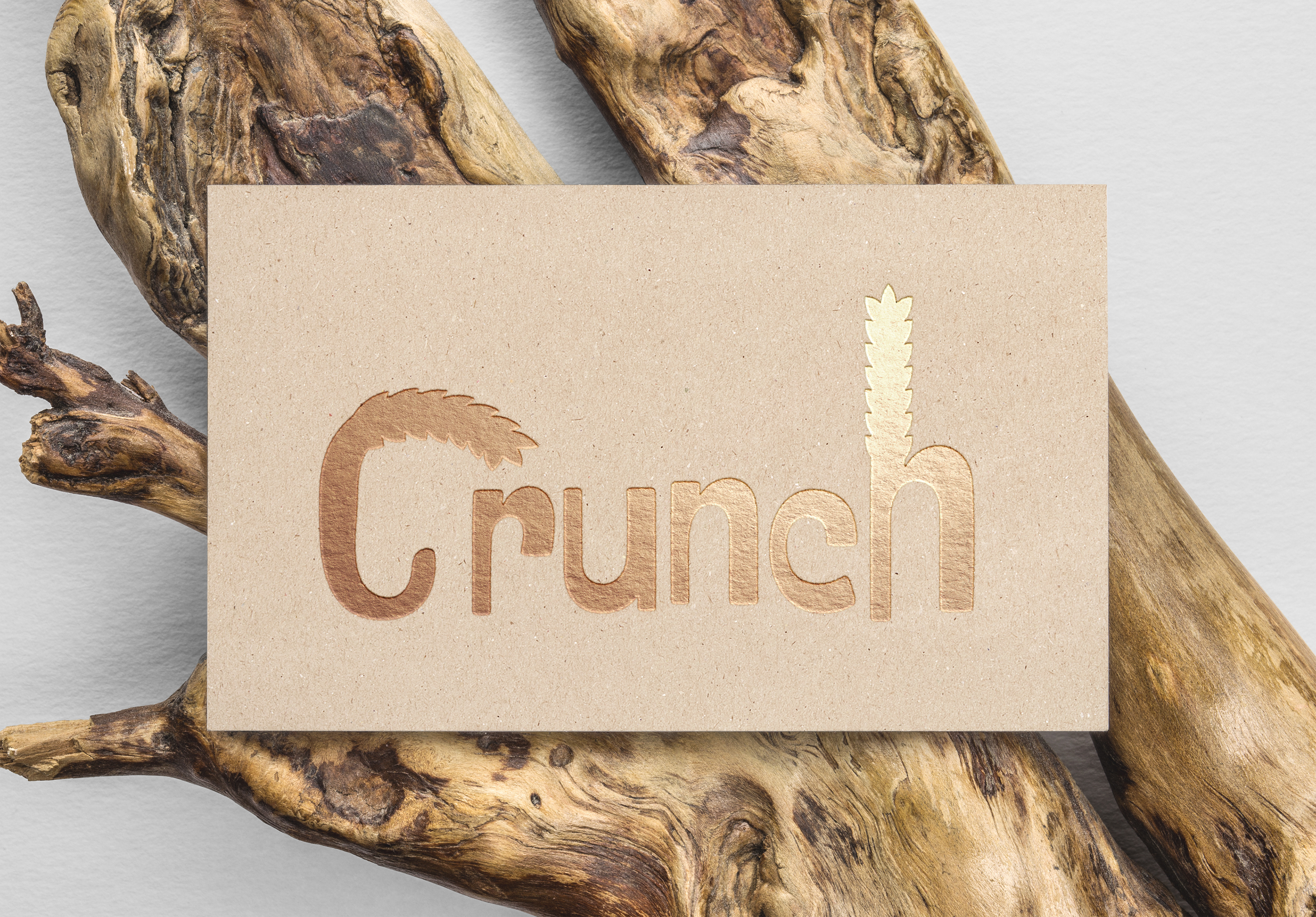
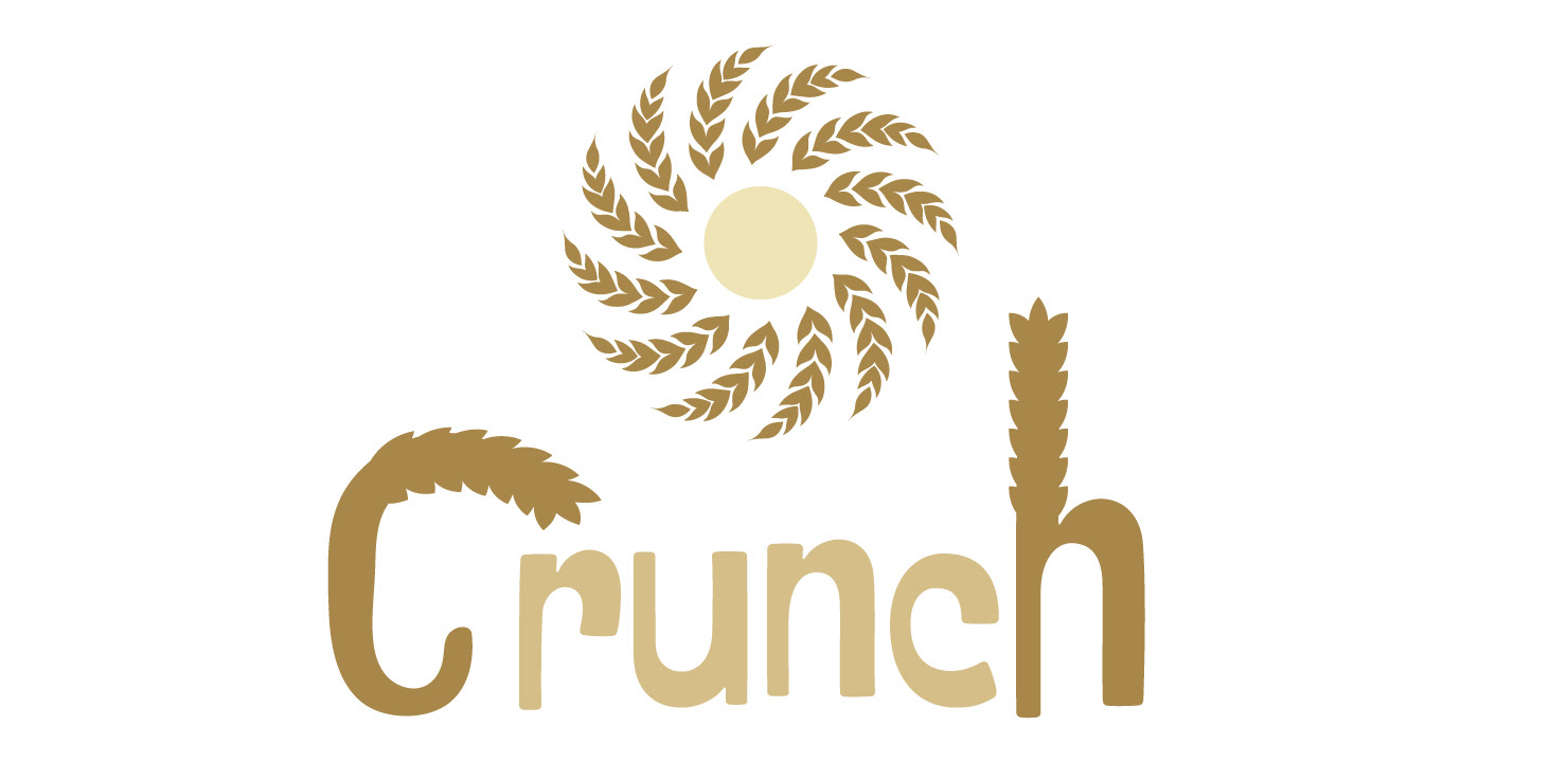
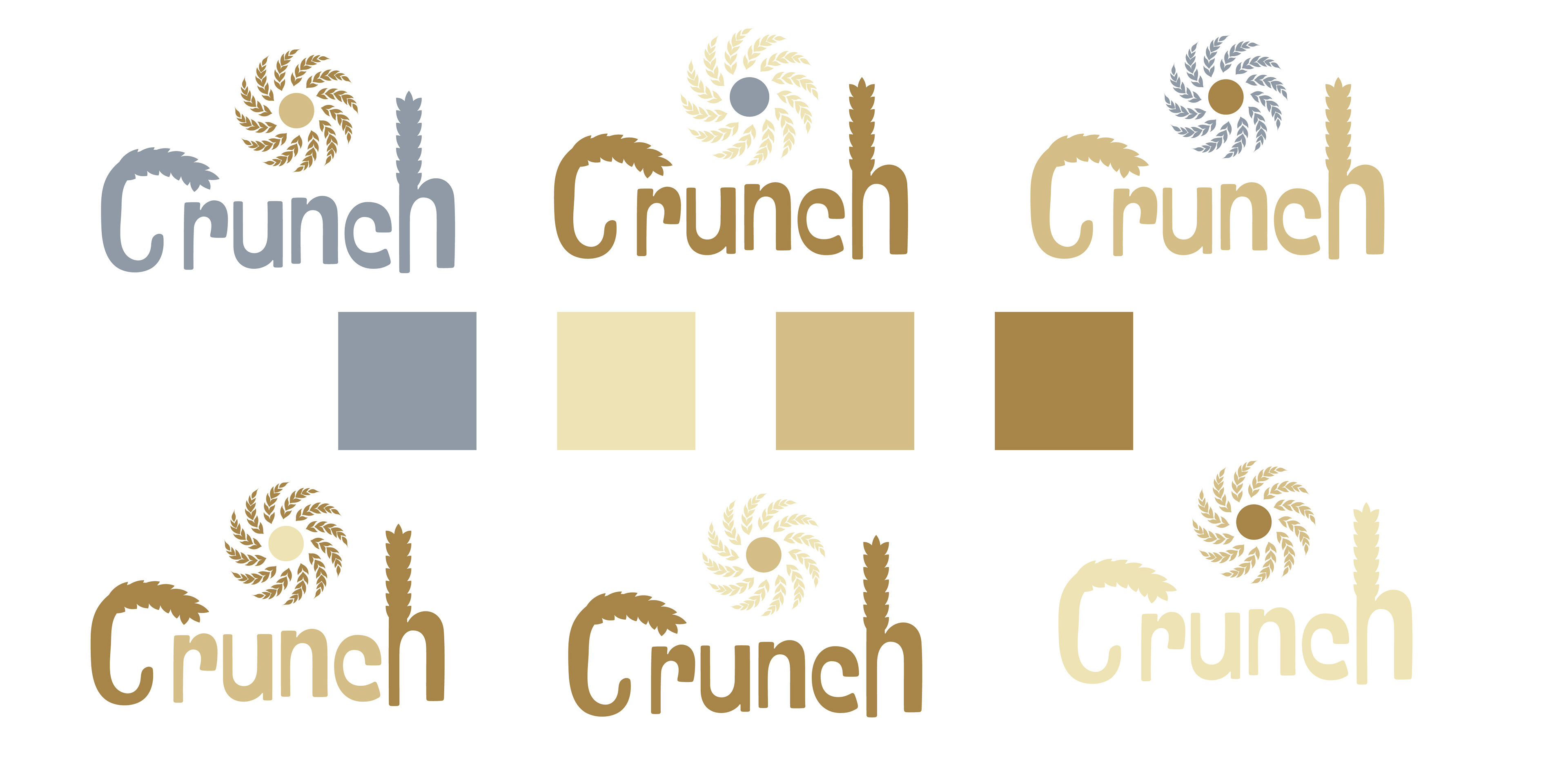
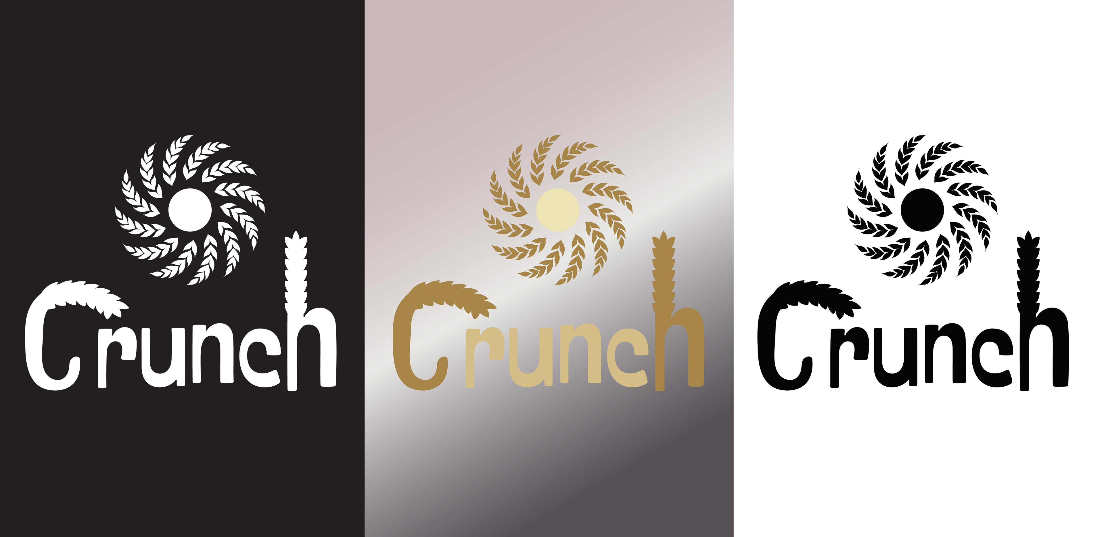
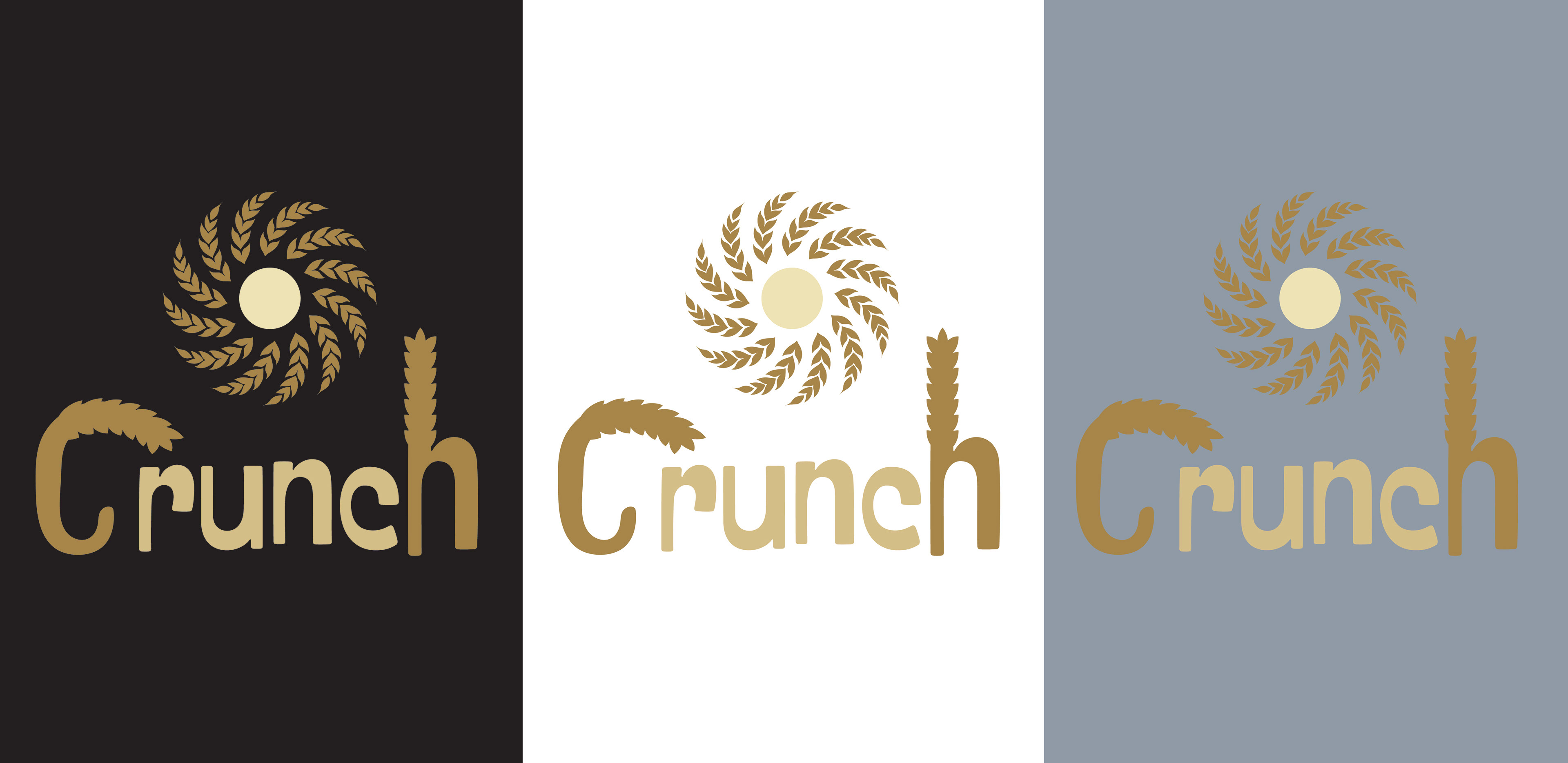
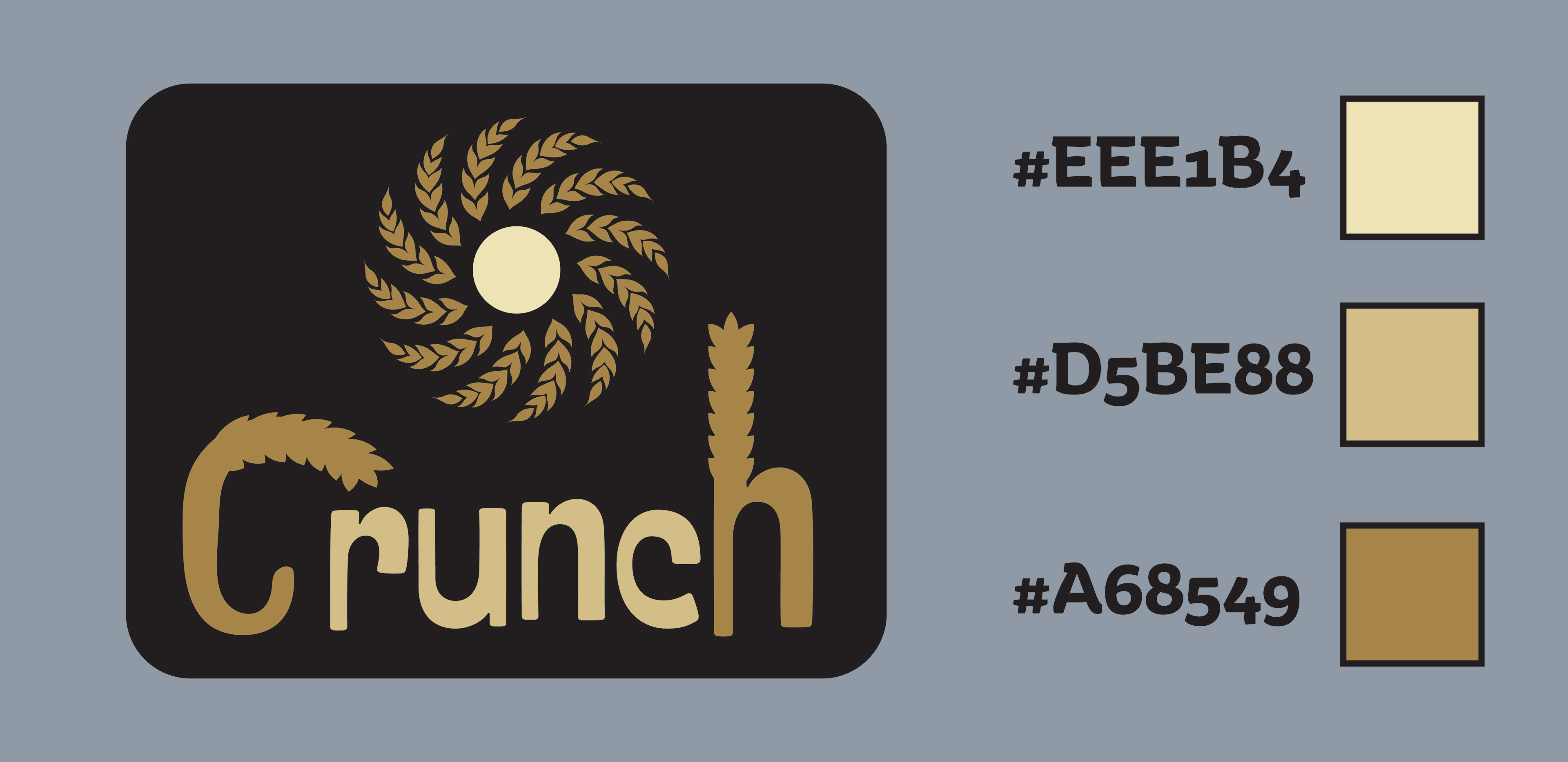
Imagine a bakery brand named "Crunch," renowned for its exceptional variety of breads and an array of wheat-based delicacies. At the heart of its identity is a logo that ingeniously blends natural elements with typographic creativity. The logo features the company's initials, "C" and "H," each artistically merged with an illustration of a wheat stalk, symbolizing the brand's deep connection to the earth and its produce. This integration not only highlights the brand's specialty in wheat-based foods but also its commitment to quality and natural ingredients.
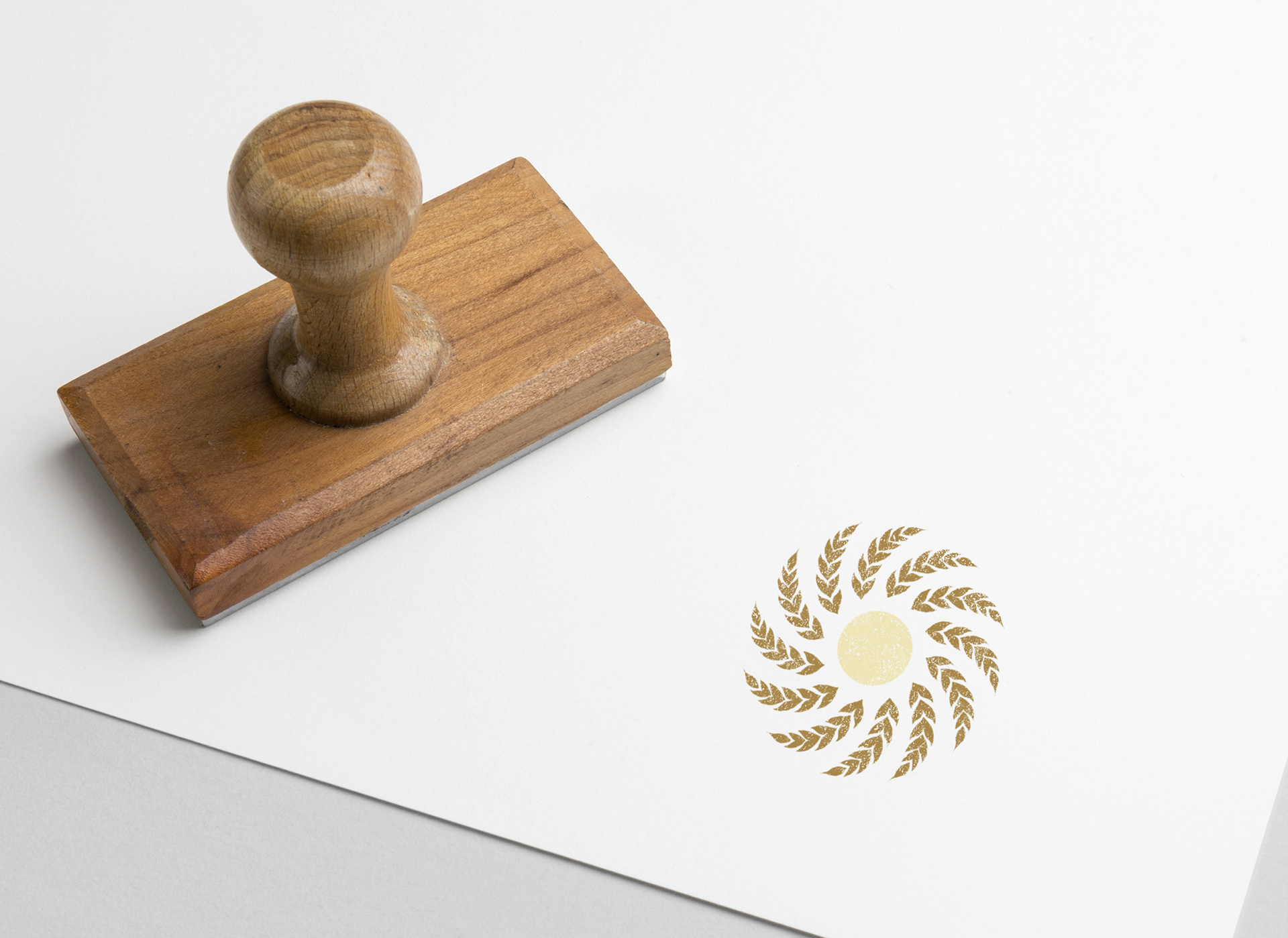
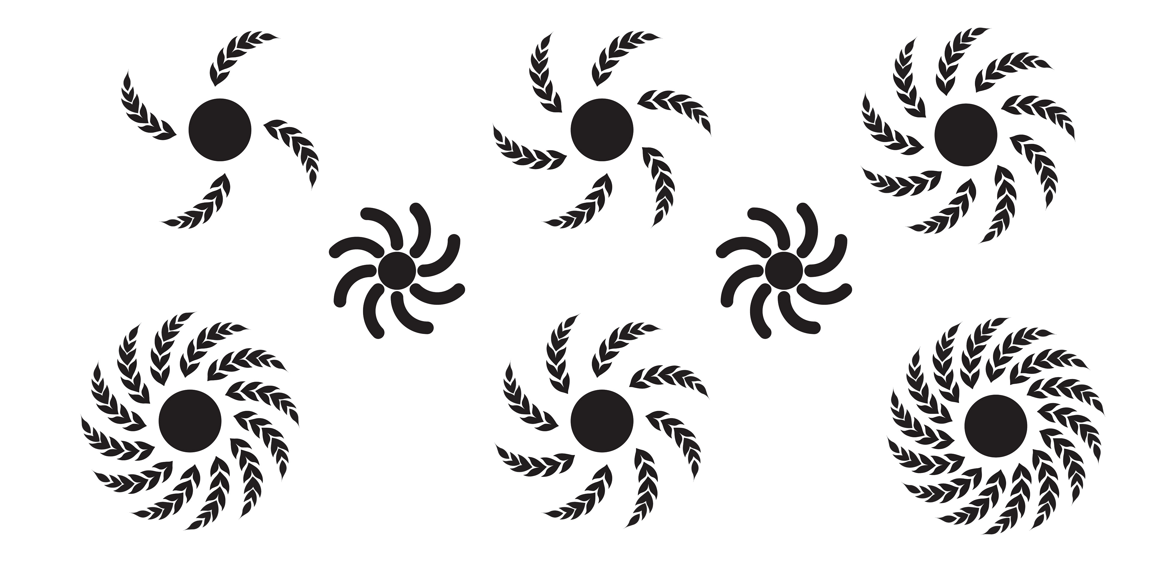
Central to the logo is an icon depicting the sun, radiating warmth and energy. Instead of traditional rays, this sun is encircled by golden wheat stalks, stretching outward like beams of light. This imagery serves as a metaphor for the brand's mission: to brighten its customers' days with its products, much like the sun illuminates the world. It suggests that Crunch plays a crucial role in starting one's day positively, offering nourishment and happiness with every bite.
The color palette of the logo employs rich shades of brown and gold, evoking a sense of warmth, reliability, and premium quality. Brown, reminiscent of the earth and wheat, stands for the brand's organic and wholesome approach to baking. Gold, on the other hand, adds a touch of elegance and value, indicating the superior quality of Crunch's offerings. Together, these colors not only enhance the visual appeal of the logo but also communicate the brand's values of trustworthiness, longevity, and commitment to excellence.
Through its visually engaging and meaningful logo, Crunch establishes a strong brand identity that resonates with customers seeking quality, natural ingredients, and a touch of sunshine in their daily lives. It positions itself as a beacon of warmth and nourishment, promising to remain a beloved and enduring presence in its customers' lives.
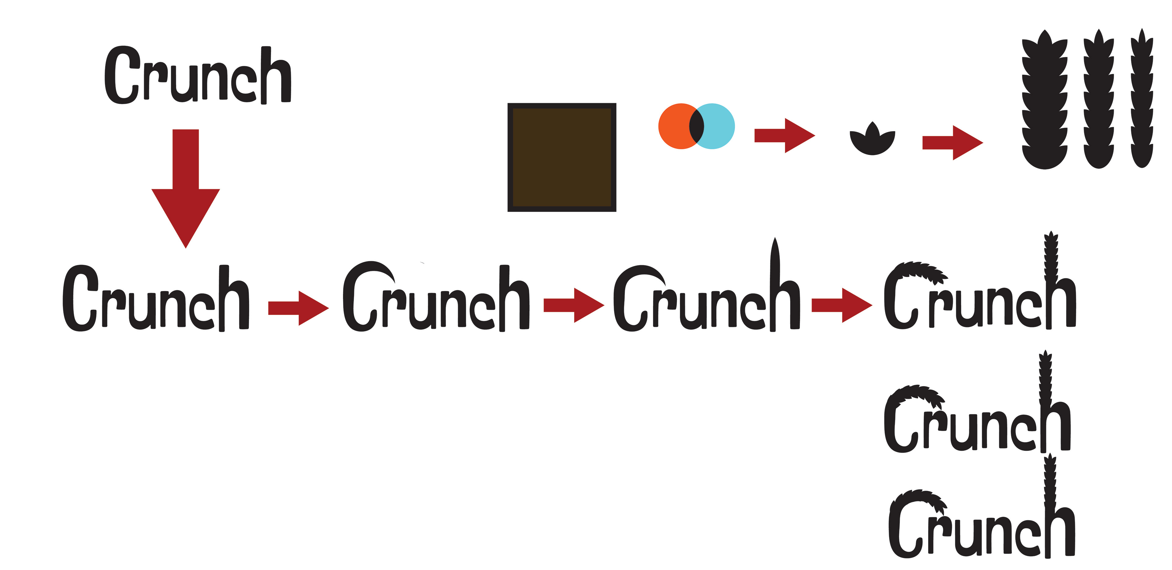
The Process
Presentation
Mockups