Midwest Legal Field Services LLC is a legal support services company specializing in process serving, document delivery and retrieval, court filings, and courthouse runs. The company provides reliable field operations that support attorneys and legal professionals by ensuring accuracy, timeliness, and compliance in legal procedures.
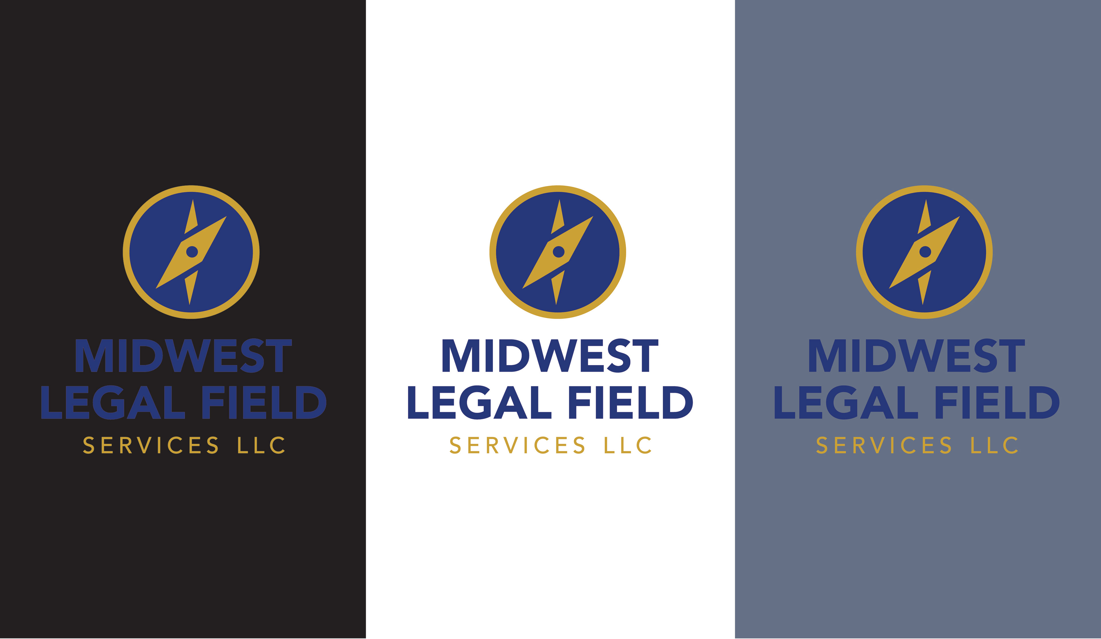
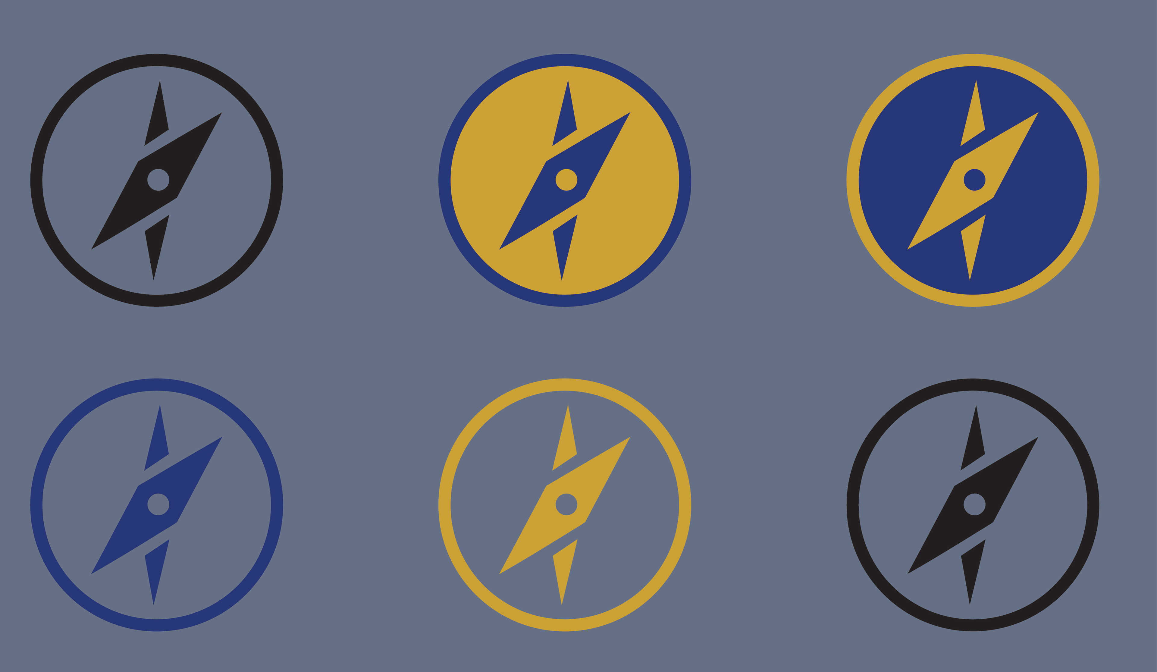
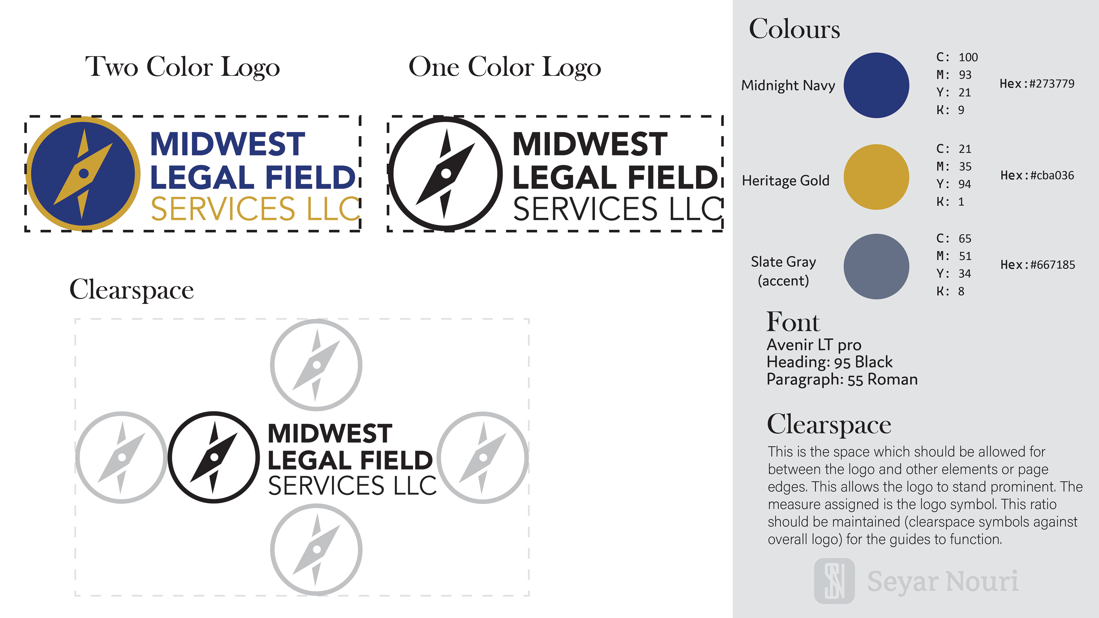
The logo icon is inspired by a compass, symbolizing direction, precision, and reliability—core values that align with both the Midwest identity and the company’s role in guiding legal processes efficiently. The enclosed circular form represents unity, structure, and completeness, reinforcing a sense of trust and operational stability.
The color palette of navy and gold was intentionally selected. Navy conveys professionalism, authority, and high-caliber service, while gold adds a sense of prestige and distinction. Together, they create a refined and confident visual presence appropriate for the legal field.
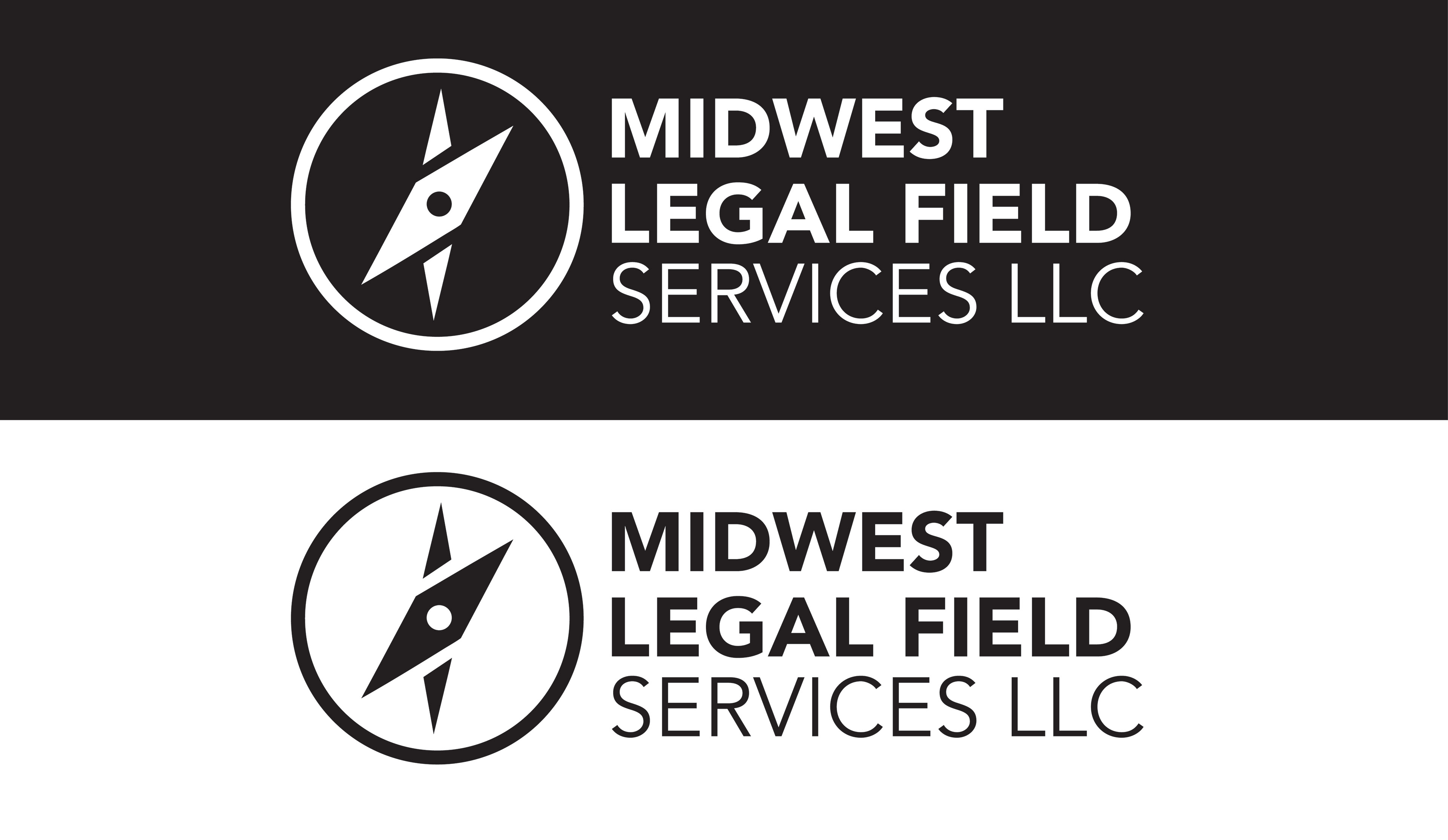
The typography is direct and disciplined, reflecting the seriousness and clarity required in legal operations. It avoids unnecessary ornamentation, reinforcing a straightforward, business-focused identity.
Overall, the logo presents a professional, cohesive, and trustworthy brand that accurately represents Midwest Legal Field Services LLC and its commitment to dependable legal support.
Client Presentation