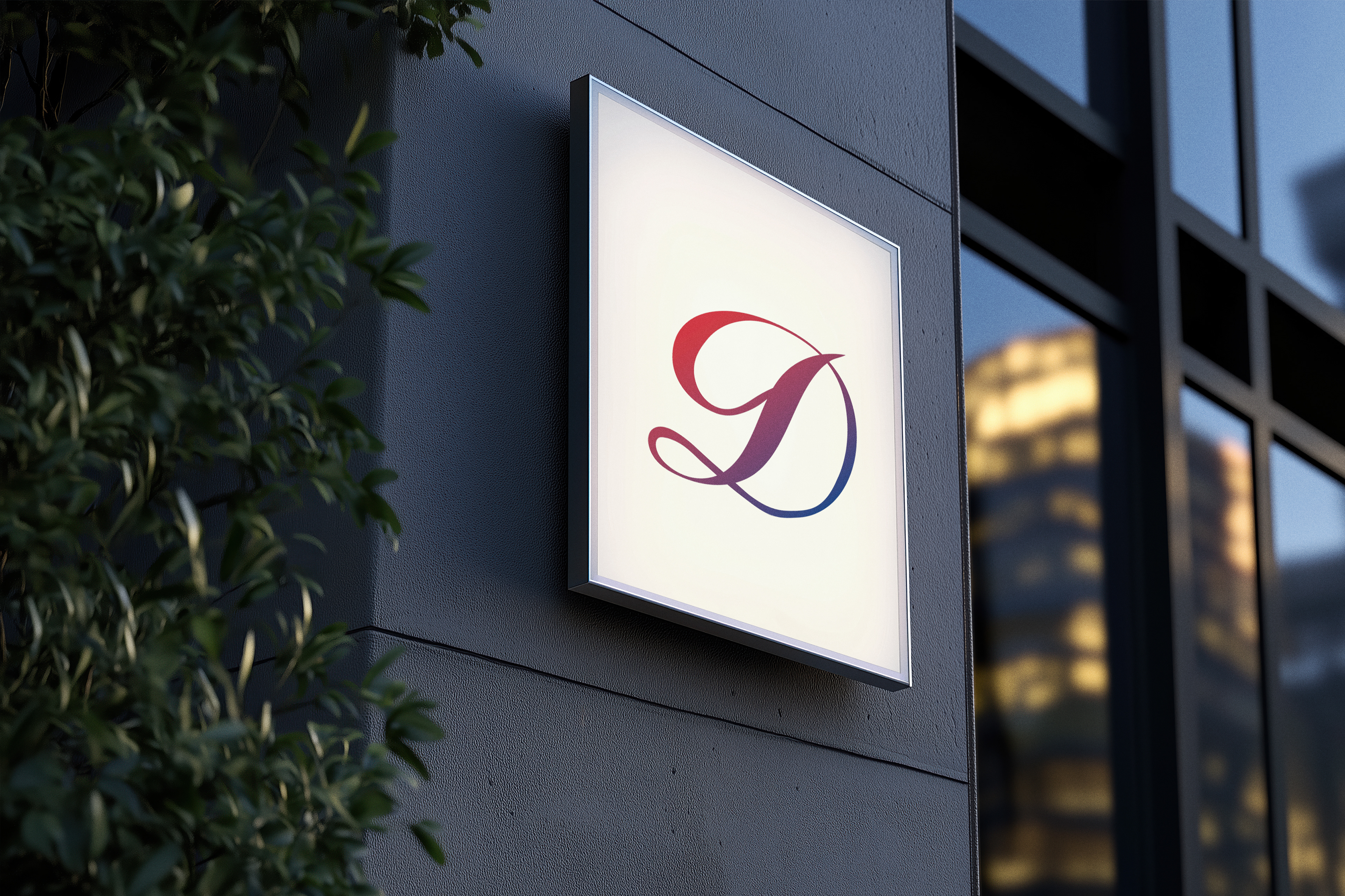
Dream Inn is a real estate company that rents out properties and housing across multiple countries. For this logo, I wanted to create a brand identity that feels both professional and aspirational—something that reflects the security of real estate but also the dream-like quality of finding the perfect place to stay or live.
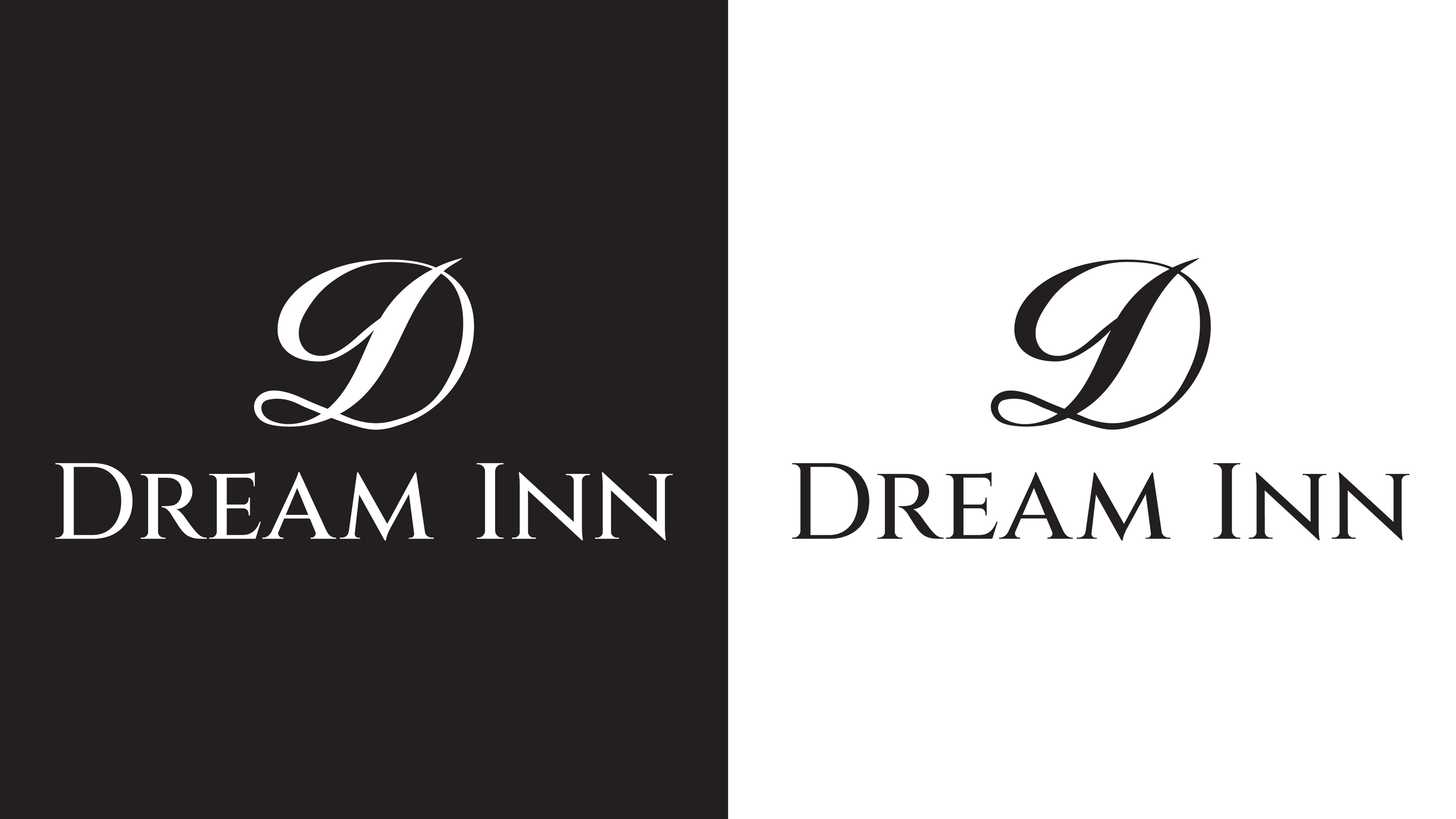
I chose a serif font for the main text because it communicates trust, stability, and a sense of tradition—qualities that are essential in the real estate world. It has a formal tone, which contrasts intentionally with the icon above. That contrast was important to me: I wanted the name to feel reliable, while the icon adds personality and fluidity to the overall identity.
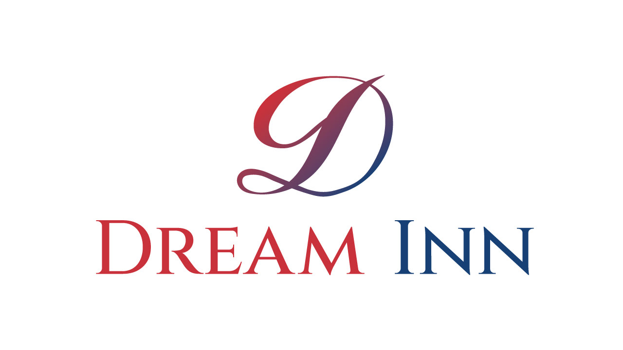
The icon is a stylized “D” that I sketched and refined over several hours. I explored a lot of directions, but I kept coming back to the idea that the “dream” aspect should feel elegant and flowing. I eventually took a handwritten, curvy typeface and customized the letter into a unique monogram by adjusting the stroke thickness and smoothing the flow of the curves. The result is an abstract yet distinctive shape that feels dreamlike without being overly literal.
It’s designed to be simple but expressive—something that could stand on its own as a recognizable mark while hinting at elegance, comfort, and motion.
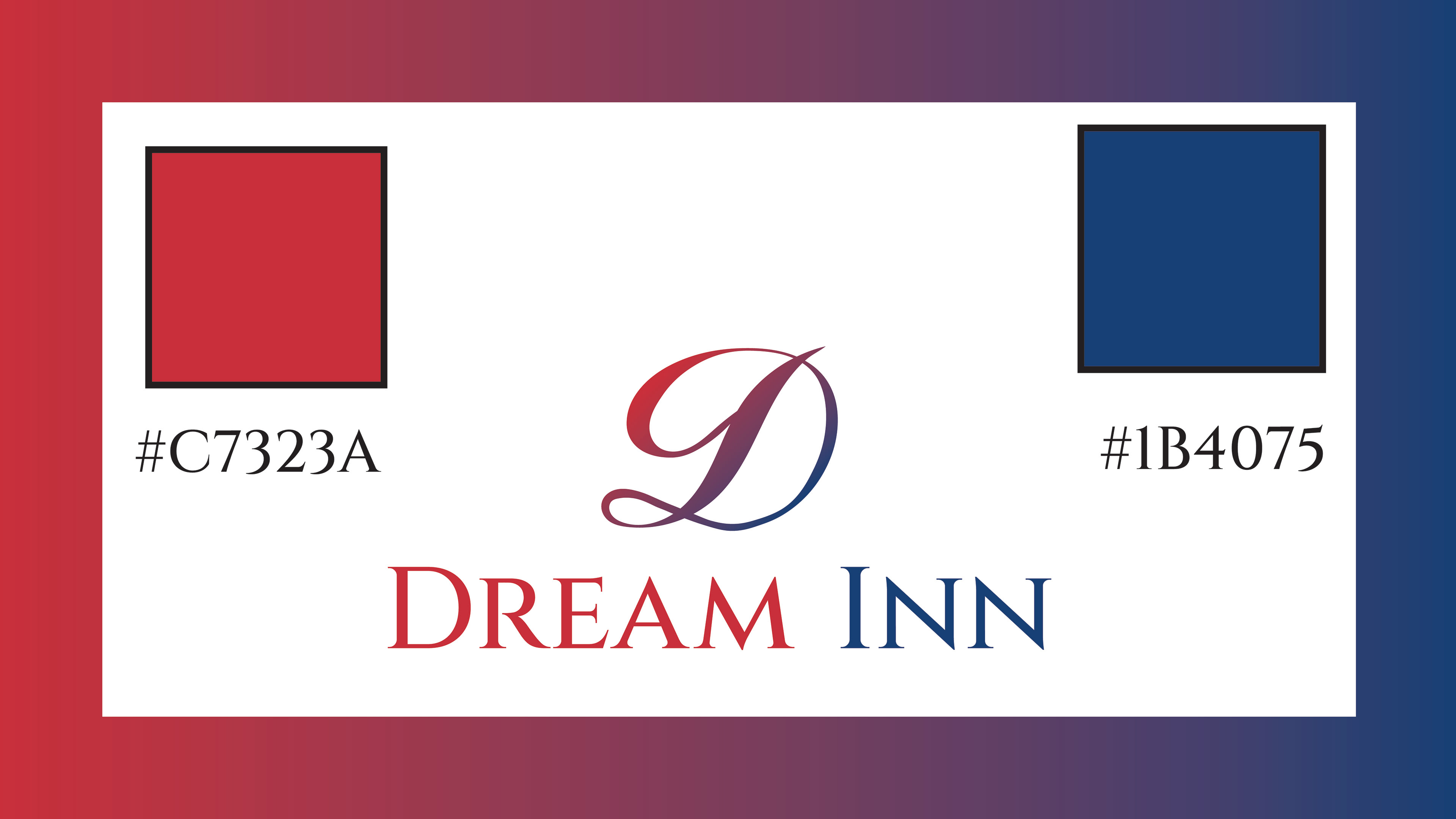
The color choice was also deliberate. I used a gradient that moves between a soft red and a deep blue. Red brings energy, passion, and warmth, while blue gives a sense of trust, security, and professionalism. The gradient in the icon ties these two qualities together—emotional and practical—creating a smooth transition between warmth and trust.
The word “DREAM” uses the red tone to highlight passion and desire, while “INN” uses the blue to bring out the trust and dependability side of the business.
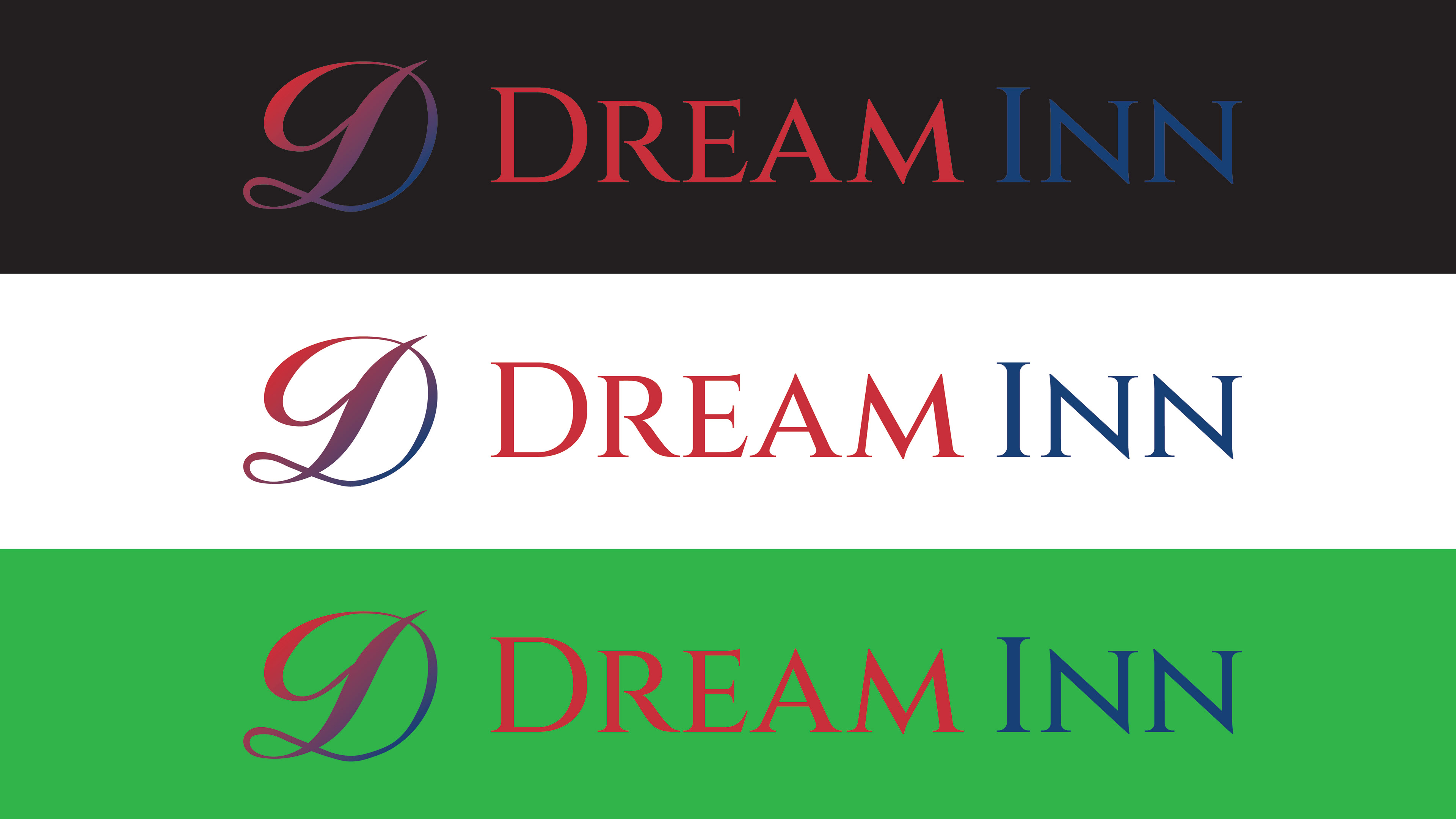
I wanted the logo to feel balanced—professional, yet not cold; elegant, yet not overly decorative. The type brings structure, while the icon brings softness. Together, they create a visual identity that’s serious enough to be trusted with real estate, but warm and imaginative enough to capture the feeling of finding your dream place.
This logo was about striking the right balance—between dreaminess and professionalism, between form and function. I spent a lot of time sketching and refining it because I wanted something that felt unique, memorable, and brandable across global markets. I think it hits that mark.
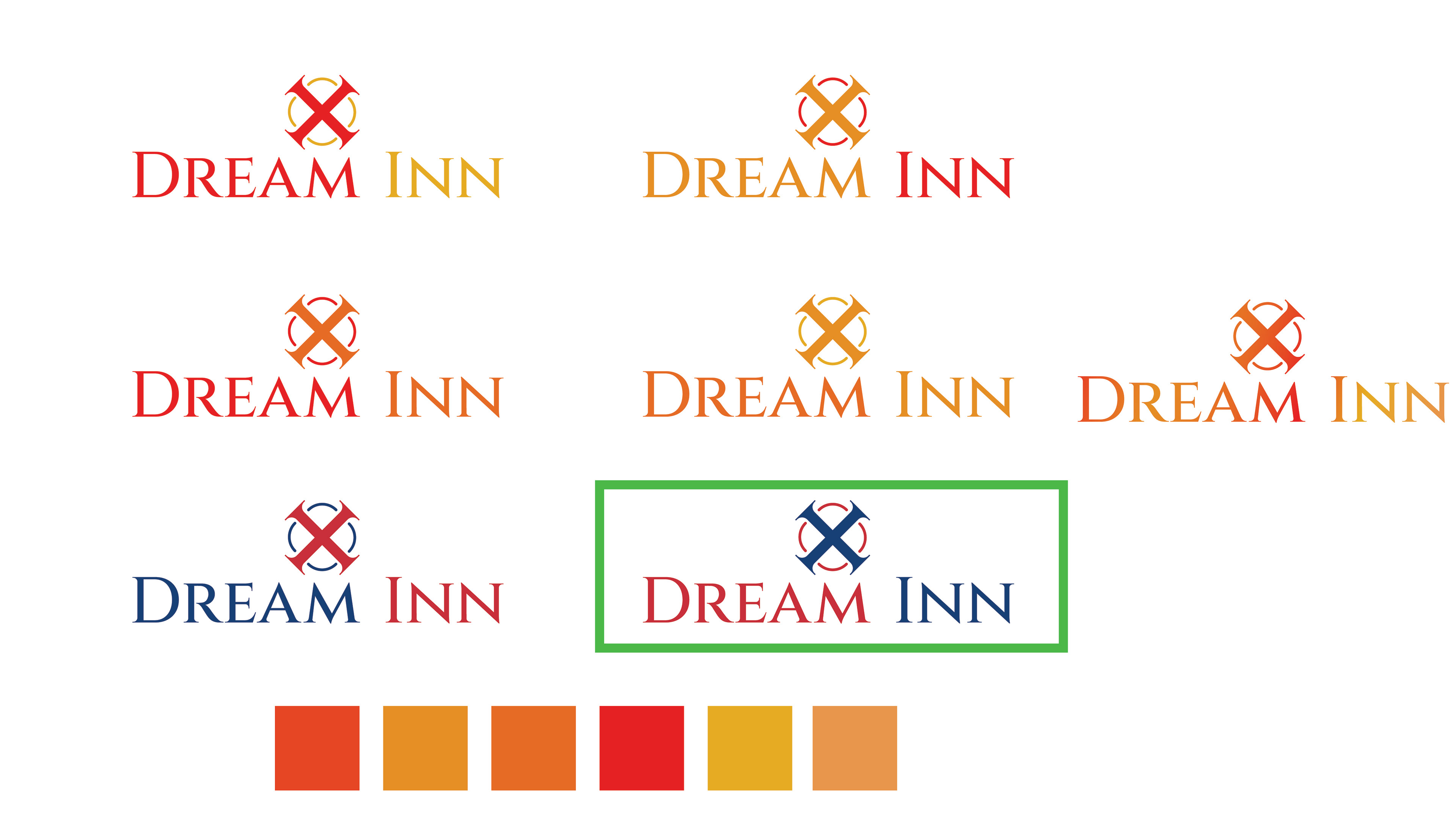
The Process


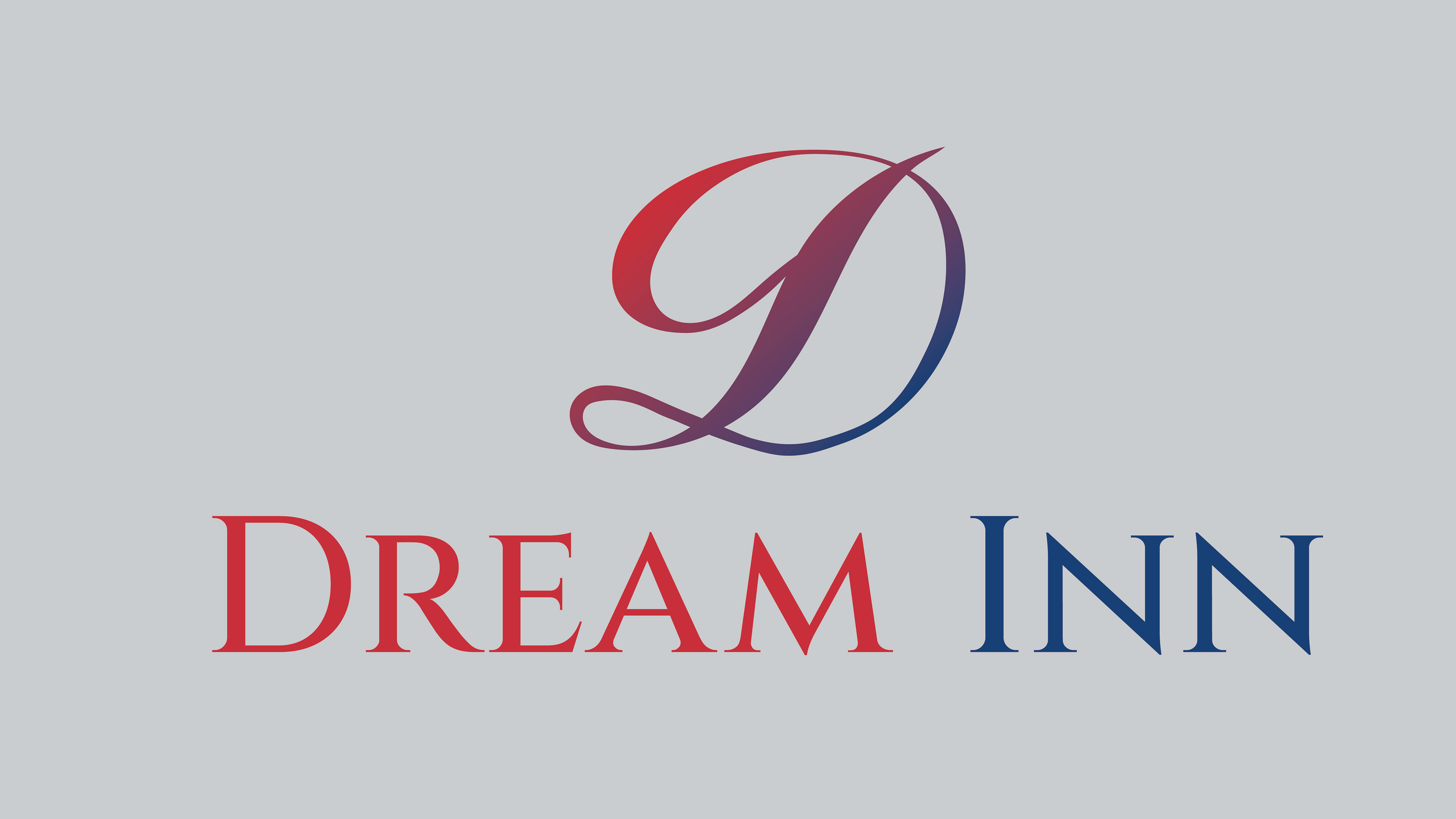
Client Presentation
MockUps