
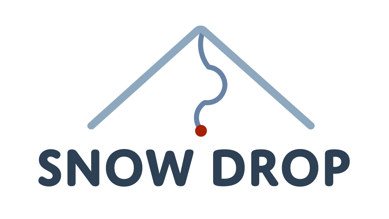
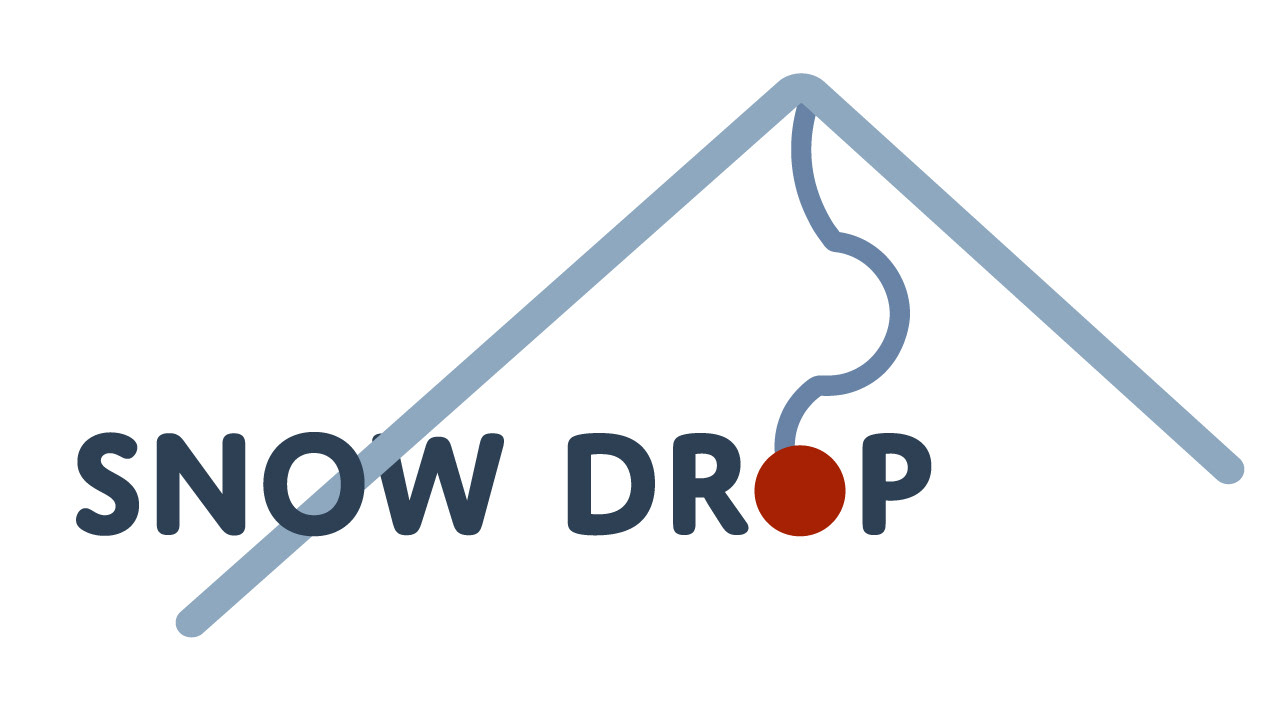
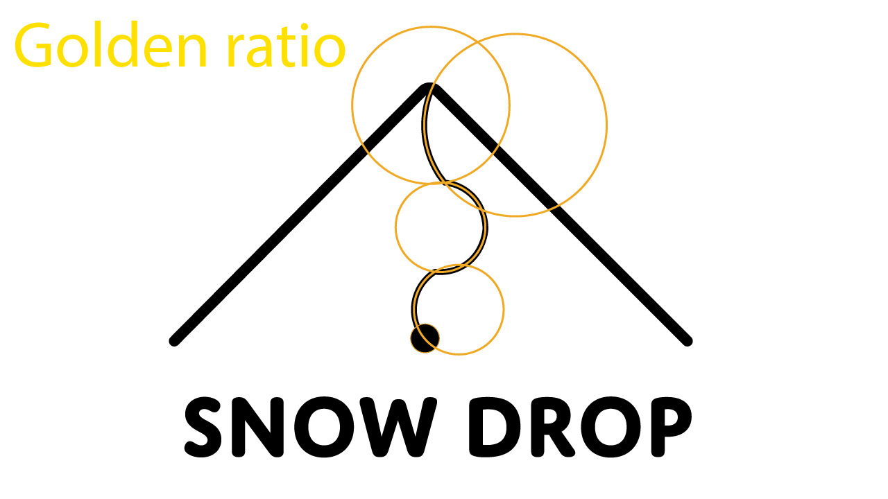
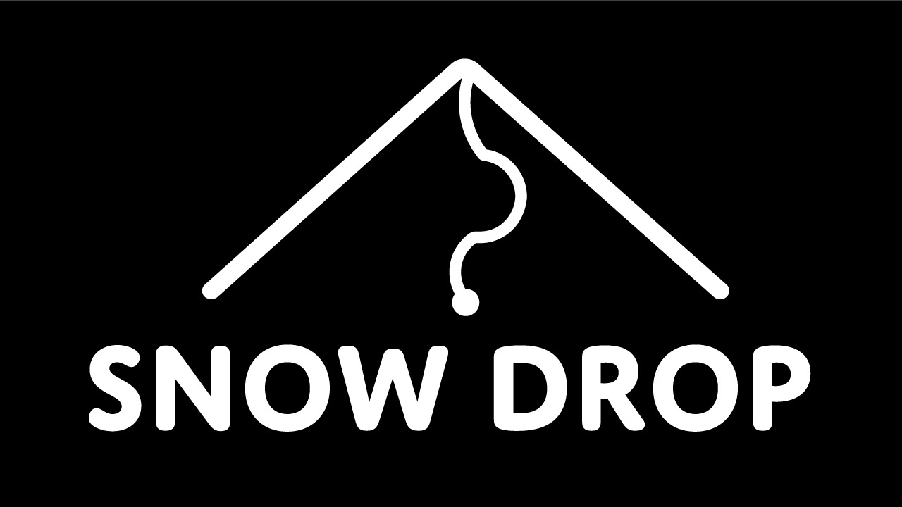
The SnowDrop logo is designed for a ski company, incorporating elements of snow, skiing, and a sense of "dropping." The logo represents a mountain with a path carved into it, leading to a prominent red dot symbolizing the destination. The color palette consists of blue and red, where blue represents winter, mountains, height, and snow, while red serves as a contrasting color representing the mark of the destination and skiing experience. The shade of blue gradually darkens as the logo descends. The logo design also utilizes the golden ratio to create aesthetically pleasing curves along the path.


The sketching process