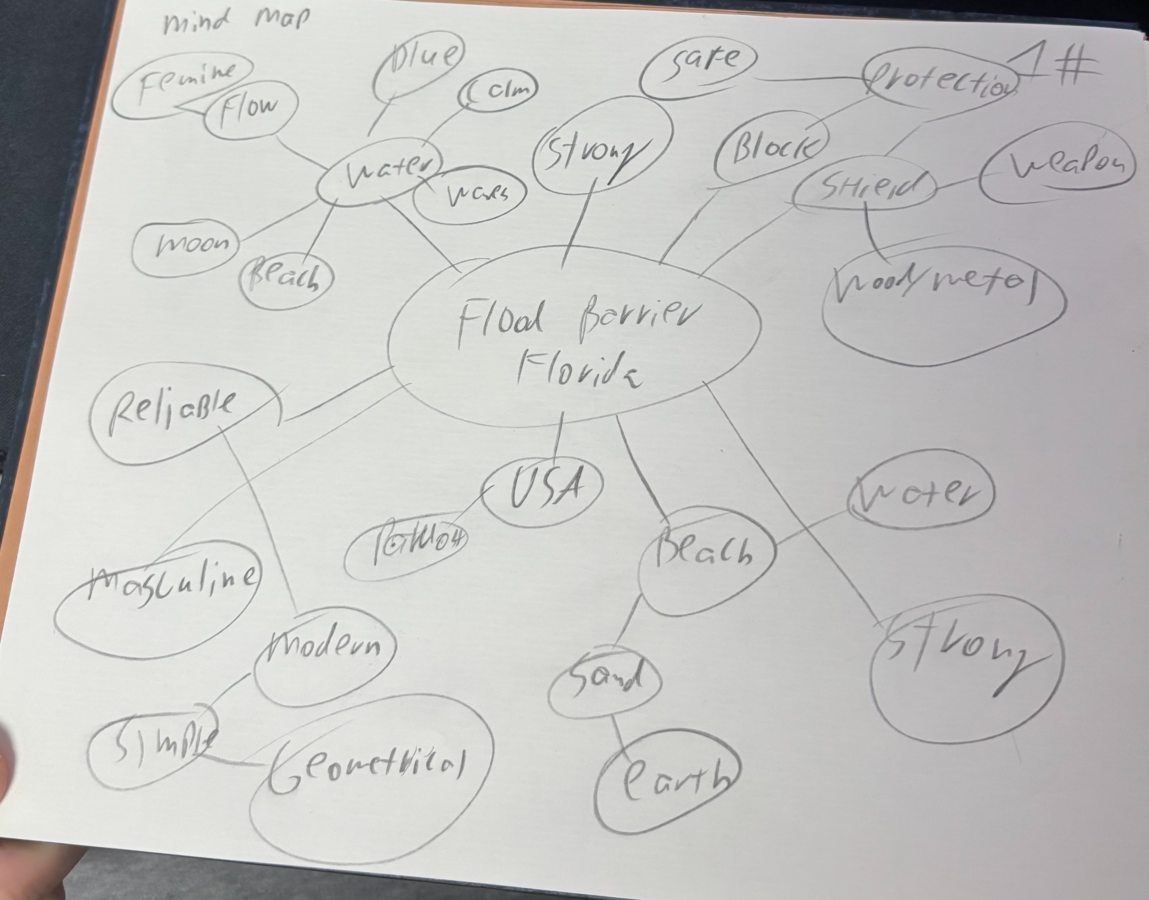
Flood Barriers Florida provides residential protection systems that defend homes from storm surge and seasonal flooding across the state. The identity needed to communicate strength, trust, and coastal expertise—confident and reassuring rather than alarmist.
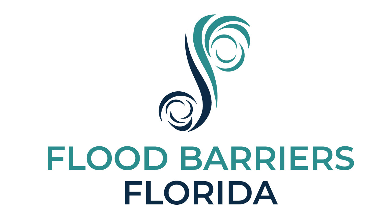
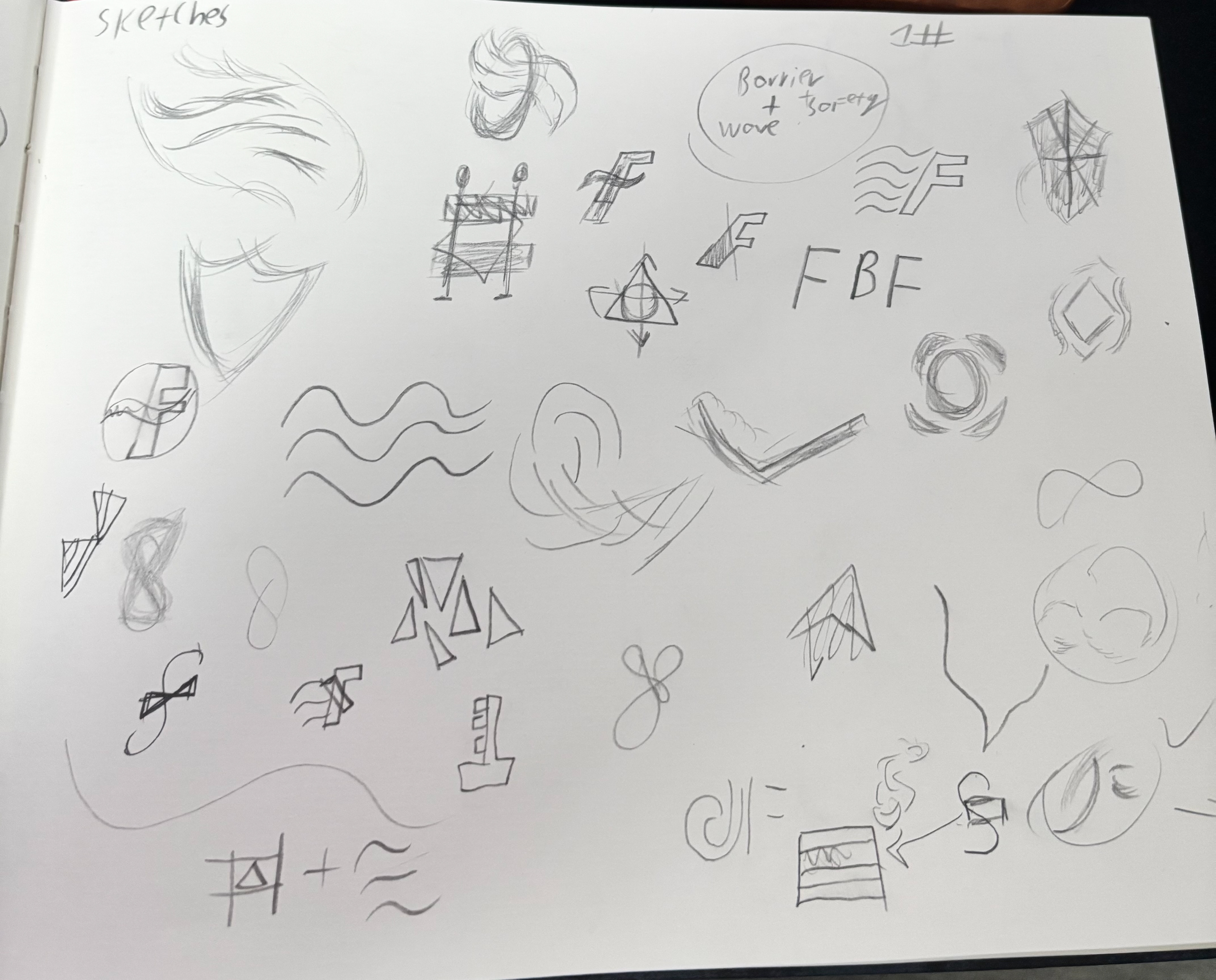
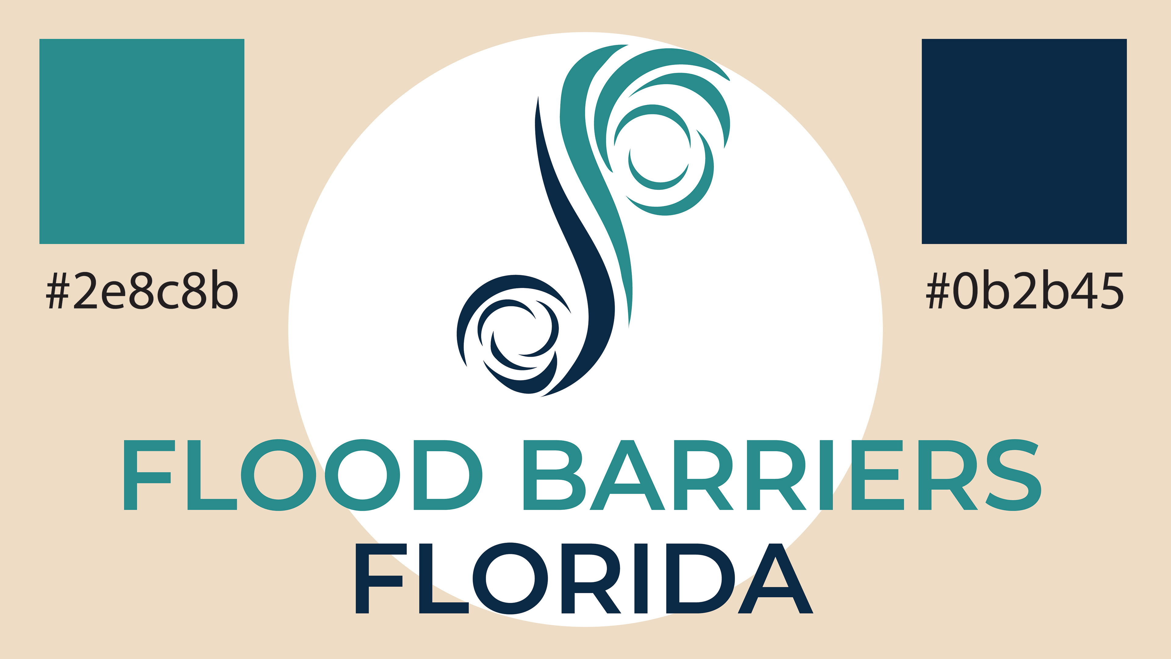
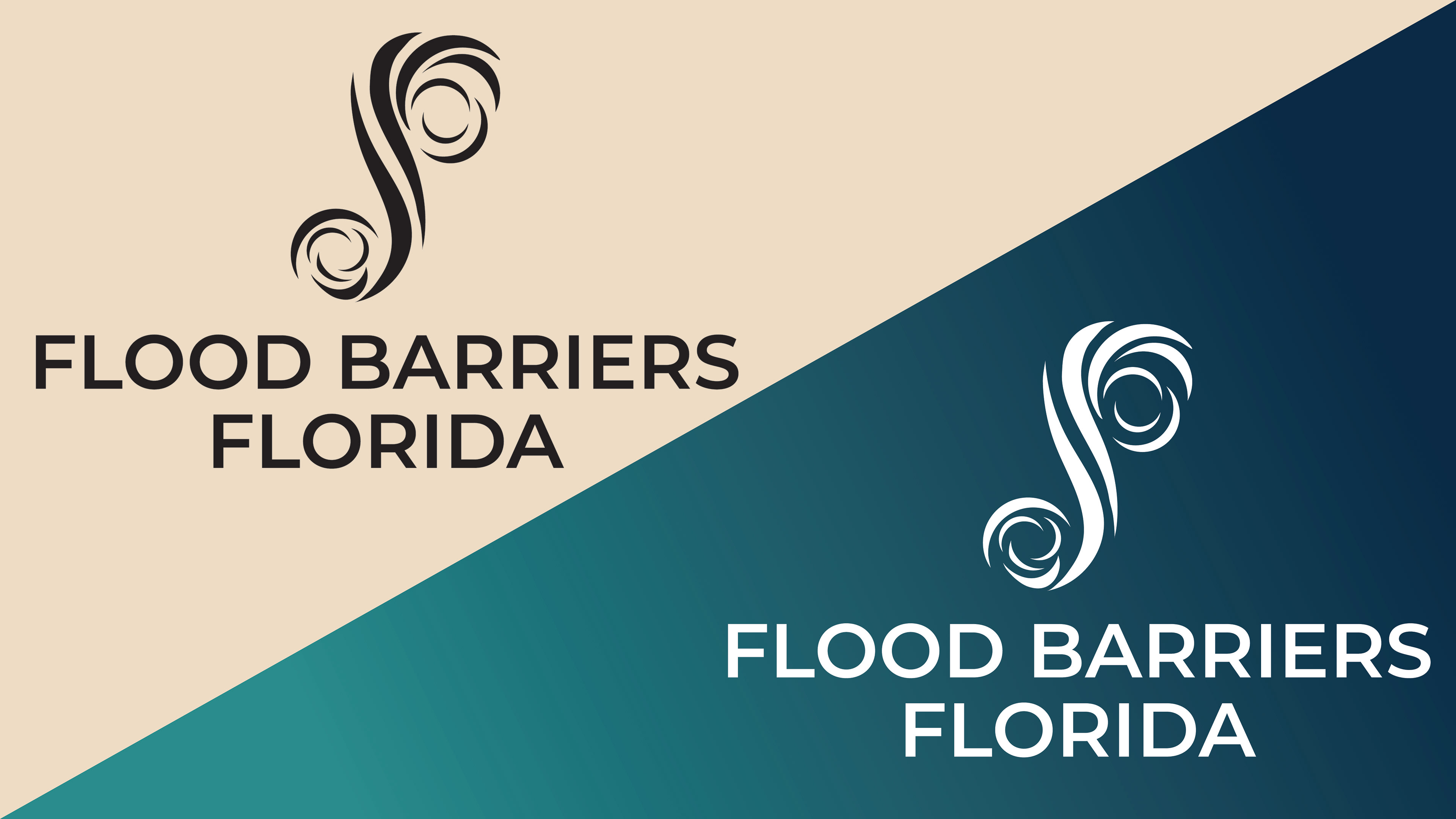
The symbol answers the client’s request for a hurricane motif. Two counter-rotating storm forms wrap around a central vertical stroke that reads as the shared spine of the letters F and B. This creates a clear monogram while visually expressing a barrier standing firm against moving water and wind. The composition balances movement (the swirls) with stability (the upright), so the mark feels dynamic yet dependable.
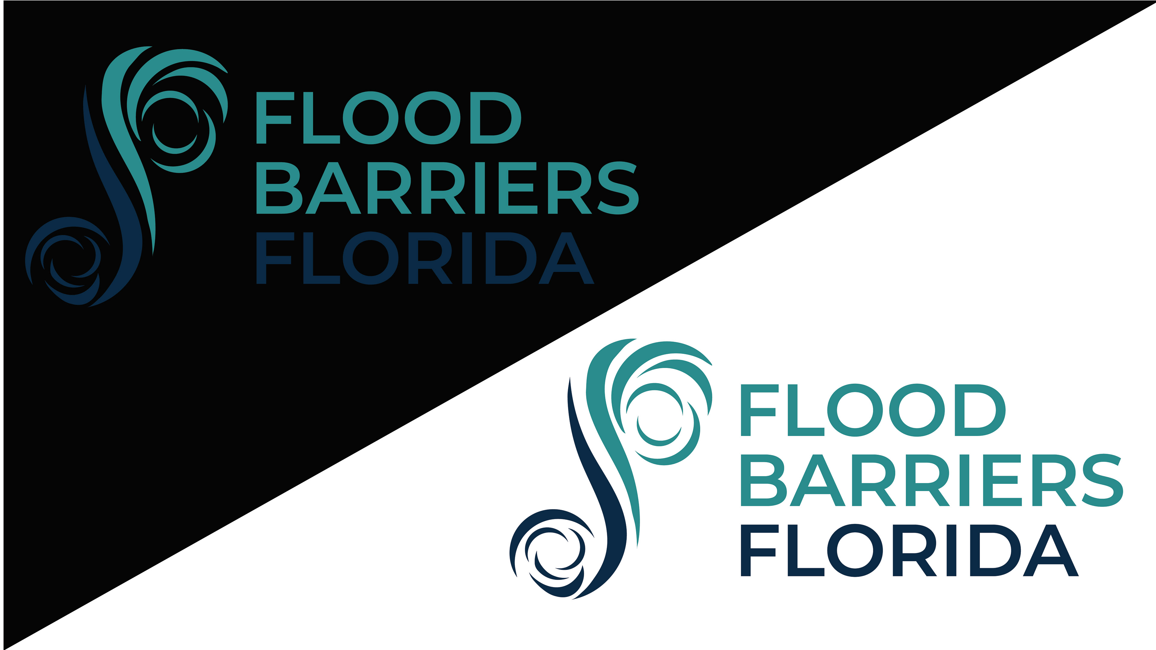
Form is governed by Golden-Ratio arcs to keep every curve proportionate and naturally pleasing. This geometric construction ensures the icon remains elegant at large sizes and crisp at small ones, making it reliable for signage, gear labeling, web favicons, and embroidery.
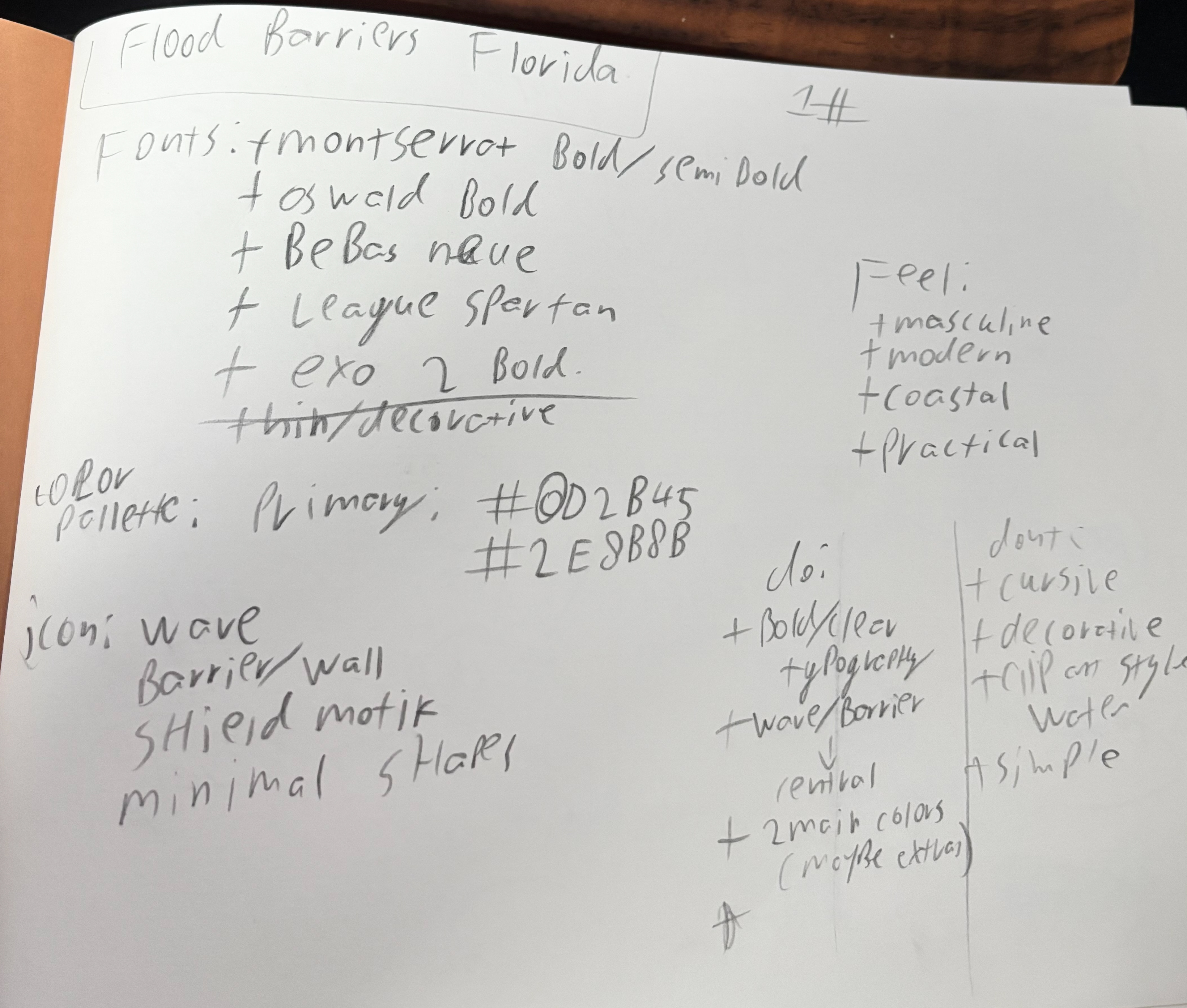
Color pairs an Atlantic teal with a deep navy. Teal cues coastline and renewal; navy signals engineering competence and trust. Together they tell a simple story: conditions intensify from calm to severe, and the central “barrier” holds. The tonal contrast also improves accessibility and legibility across digital and print environments.
Typography is a bold, geometric sans-serif set in uppercase for authority and high readability. “FLOOD BARRIERS” carries primary emphasis, while “FLORIDA” in the darker tone anchors the mark to place and provides a strong visual base. The type feels modern, engineered, and professional—aligned with a safety-critical product.
The system is built to work hard: one-color and reversed versions reproduce cleanly for stencils and emergency signage; curves from the symbol extend into patterns and motion graphics for brochures and web; recommended clear space is at least the height of the “O” in FLOOD around the lockup; and the full lockup should stay above ~24 px tall on screens for clarity.
Tone of voice is calm, practical, and reassuring, emphasizing prevention, certified performance, and straightforward installation: Protect what matters. Be ready before the storm.
Overall, the identity delivers a coastal, engineering-forward brand that signals resilience. The hurricane reference is immediately recognizable without being literal or sensational, and the F/B monogram, Golden-Ratio curves, confident type, and oceanic palette combine into a mark Floridians can trust when conditions turn severe.
The Process

Client Presentation


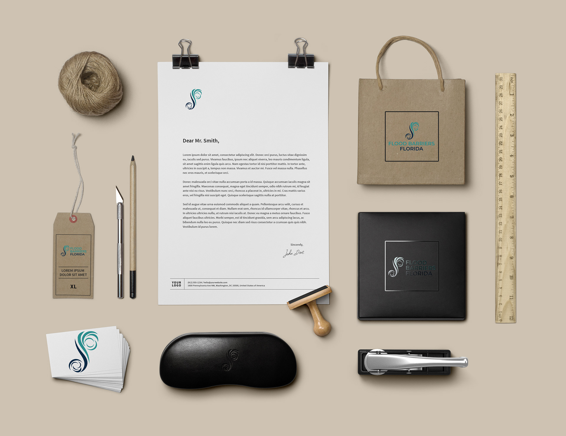
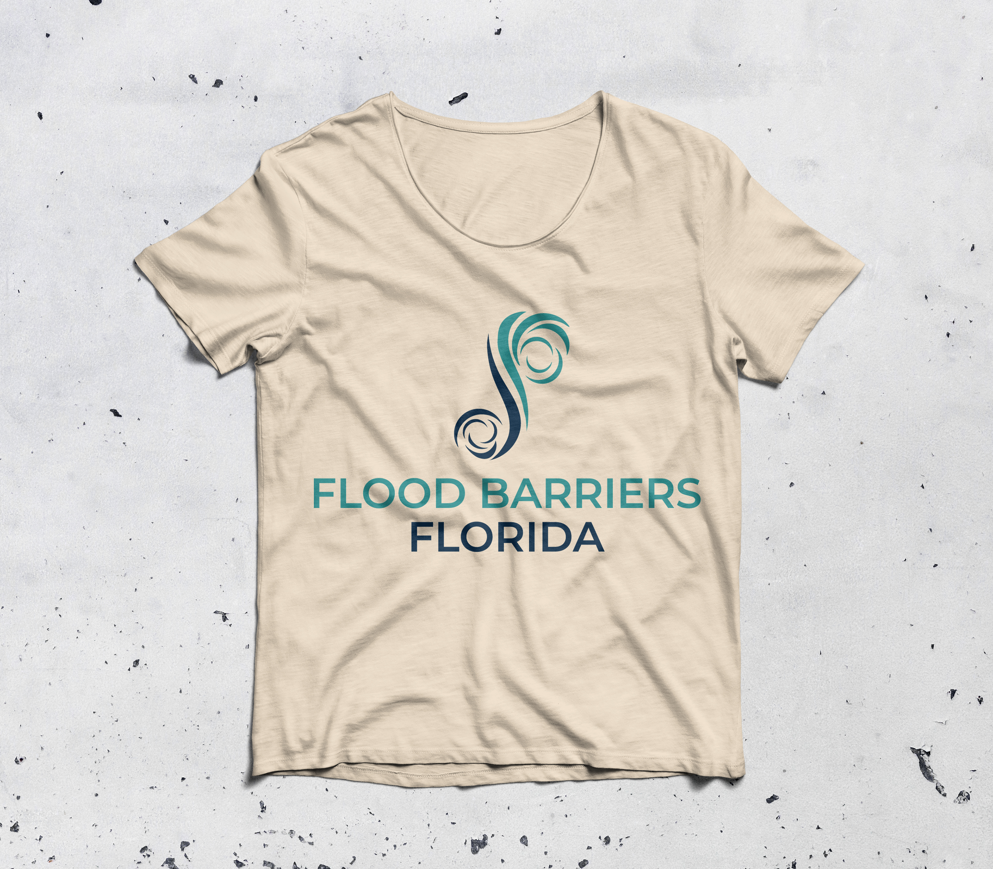
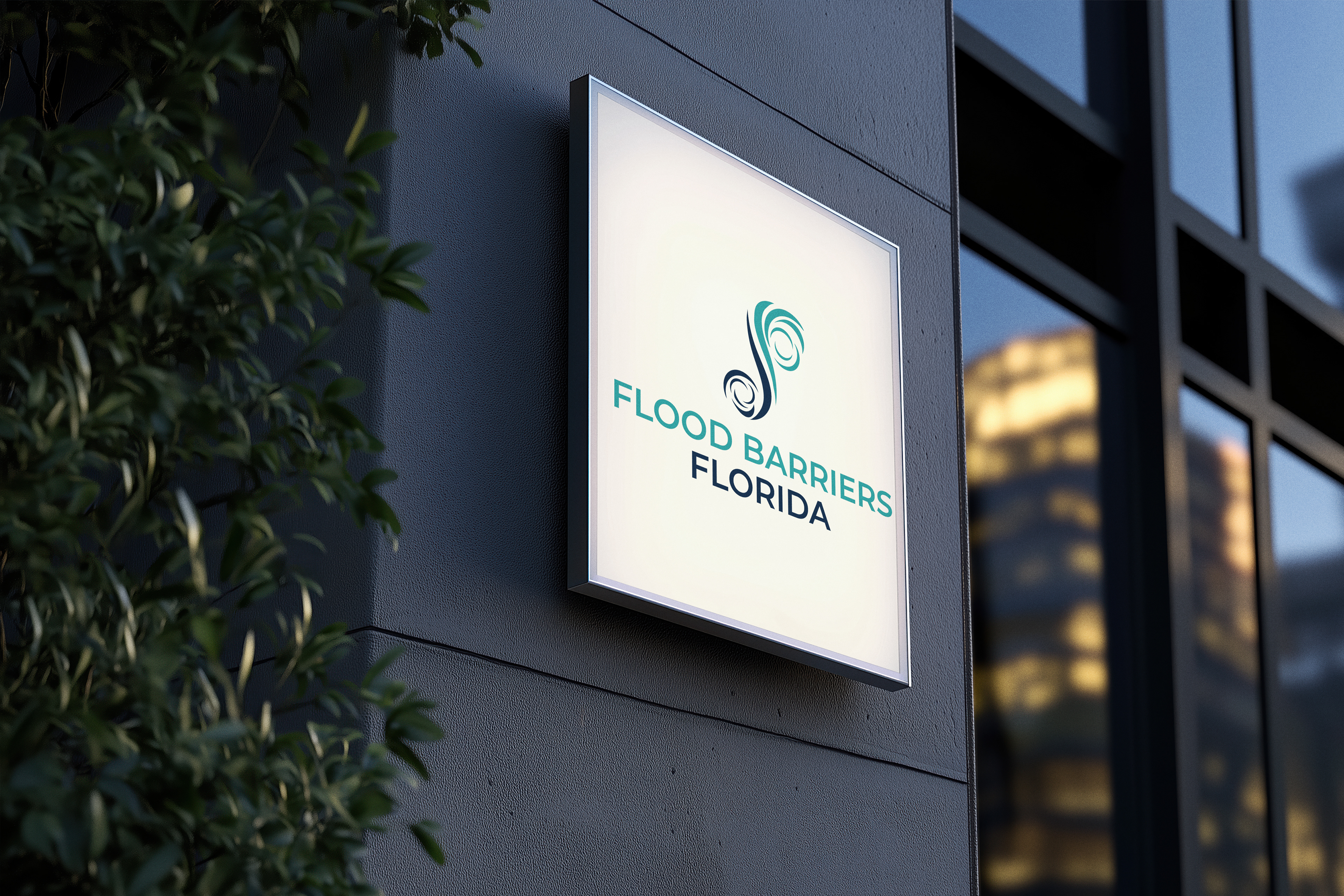
Mockups