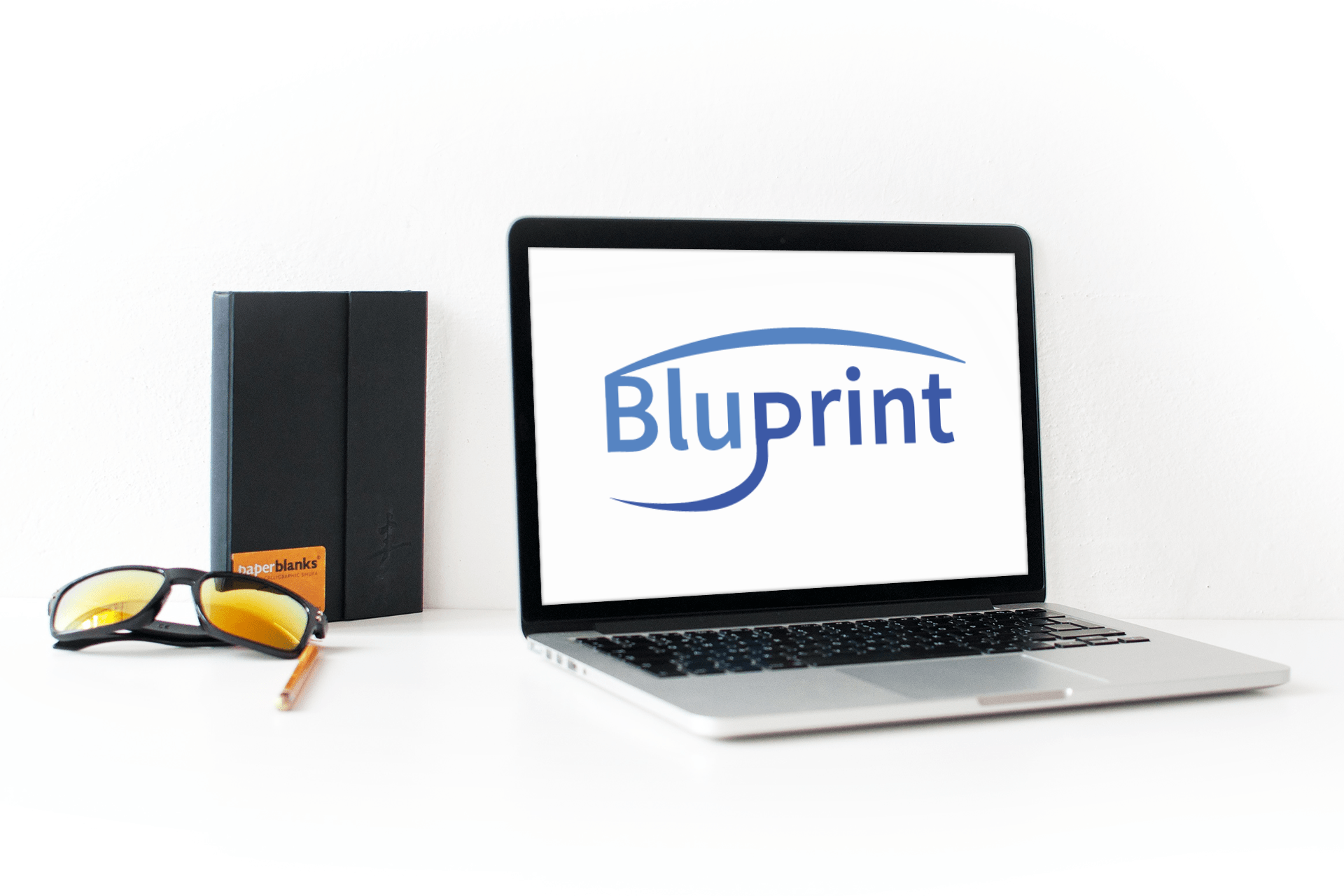
This is a logo for an architectural software made in Adobe Illustrator. The client requested a simple logo with custom text and Sans Serif as font. The color combination is to represent a software feeling. The B and P have a curve that represent architectural structure and the client wished for a simple, yet professional design. The colors should highlight the feeling of technical availability.

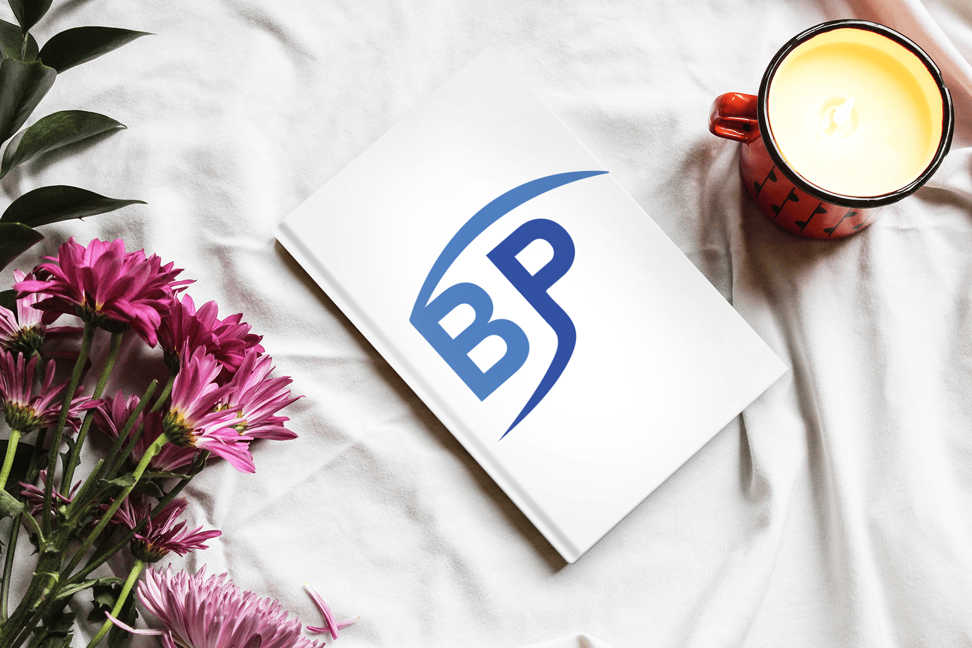
This icon represents the logo in a much smaller version of itself. This is used to brand different items and it makes a recognizable feeling towards the customer. As i mentioned the blue color gives off a trusting feeling. Since this is an architectural software logo, it is convenient to make these colors blue to showcase trust and profession. There are more mock-ups photograph to illustrate how this logo would apply to real life branding.