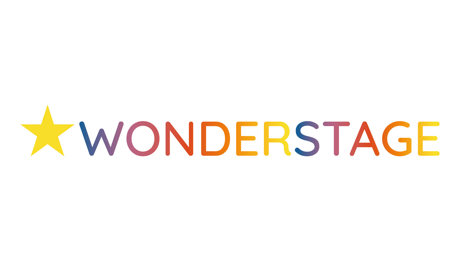
The client wanted a visual identity that felt simple at first glance, yet full of charm when you look closer. I created a clean, friendly star symbol paired with a playful, rounded wordmark that shifts through a soft multicolor gradient. In most branding work, logos should never depend on color — but in this specific case, the identity revolves around storytelling, lights, stage transitions and emotional atmosphere. A dynamic gradient becomes part of the brand’s personality, not a crutch.
A major part of this project was precision. The spacing, proportions and visual rhythm between each letter needed to feel effortless, especially because children’s theatre brands often rely on shapes that look “fun” but still read perfectly from a distance. I spent time refining kerning, optical balance, and the way the gradient flows naturally across the entire wordmark so it feels like a smooth stage-light transition rather than random colors.
Overall, WonderStage combines simplicity and theatrical emotion — a clean mark with a lively soul, designed to stand out on posters, programs, digital banners and stage signage without losing clarity or warmth.